QUILTS & FABRIC: PAST & PRESENT


Showing posts with label Arnold's Attic. Show all posts

Wednesday, October 20, 2010

Document and Reproduction: Rose and Repeat


Document print for Rose
in my Moda collection Arnold's Attic

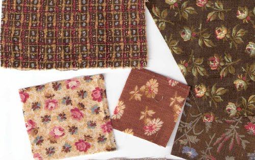
Here's a swatch from Arnold's Attic. He cut it from an old skirt that his great-great grandmother Mary Barbara wore in the 1890s when she was about 65 years old. You can barely see a seam on the right side of the swatch, indicating it was cut from a garment.

Arnold noted it was a Balmoral skirt, a style of full skirt fashionable in the 1860s. Mary Barbara probably wore the fashions of her youth late into the 19th century. A black print with a purple figure---conservative in color, yet fashionable in design---would have been appropriate for a lady on the shady side of middle age.

Arnold actually sent two swatches; the one stitched to the note is a fabric scrap leftover from the dress. It's brighter purple than the cotton that survived in the acutal garment, so Mary Barbara's original dress was a touch more flamboyant when she first wore it.

We used neither black nor purple in the Arnold's Attic reproduction collection but the print is perfect for the time period so we offer it in three colorways reflecting the autumn tones. The print name is Rose.


Women about 1880
Women didn't often have their pictures made with their aprons on. The apron fronts are pinned to the dress in typical fashion. One woman wears a stripe; the other a floral with a regular repeat that includes space between the figures and larger figures than would have been popular in the 1860s.

How is Mary Barbara's print perfect for later in the 19th century?
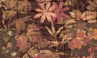
There are a few design characteristics. One is the naturalness of the drawing. Rather than a mere suggestion of a floral as in the reproduction from the mid-19th-century below, the figure in the Rose print is realistic enough that we might recognize it as a wild rose. It's a natural image whereas the figure below is just a suggestion of a floral, what was sometimes called a mignonette (a cute little thing).

Corn Shuck Hat from Civil War Homefront

This print from my Civil War Homefront collection with small floral mignonettes was the fashionable style when Mary Barbara was a young woman in the 1860s. One name for this formal grid style is a foulard print.
Another important style characteristic in fabric is the repeat, how the figure is formatted into identical motifs. All printed yardage requires that the pattern be repeated in regular fashion. The individual figures must fit into an overall pattern, which is sometimes obvious as in the Civil-War-era pattern above with a simple half-drop repeat. Each little figure is dropped next to another half way down. The overall look is a regular diagonal grid, a style of repeat that was hot in the 1860s.

Madonna print in Avon Brown

By the 1890s the fahionable repeat style was what textile designers call scattered. The repeat, like the floral figures, should look more natural than formal. The florals above are repeated in regular fashion, but not so obviously as in the foulard. Tricks to make the repeat look more natural are to add more space between the figures, and to flip and rotate the figures.


Magnolia print in Augusta Red


Joyce sent a photo of a wallhanging she made with the Arnold's Attic prints. Note how the different repeats catch your eye in different fashion. The rather formal leaf print on the outside border contrasts nicely with the loose curve in the patchwork.


Designing a fabric collection means offering several styles of repeat for contrast. Designing a reproduction collection means offering more regular foulards for an 1860s line and more scattered repeats for an 1890s line.

For more on repeat and how designers do it click here to see the Design Sponge blog:


Marit's posted a photo of a candlemat she made with a charm pack of Arnold's Attic
See her blog here:
See more about the Arnold's Attic collection by clicking here:

And check your local quilt shop for Arnold's Attic. Usually, shops have a hard time reordering designer prints but tell your shop owner that Moda has notified me there is lots of Arnold's Attic available for re-order.

Arnold's Attic in a strip quilt by Georgann Eglinski

Saturday, September 4, 2010

Document and Reproduction: Sparta

Document

The document print for the Sparta fabric in my Arnold's Attic collection dates to about 1880-1900. I called it Sparta after a place name in Arnold's neighborhood.

It's an eye-catching print---little shredded wheat bites and pink commas floating on a carmel-colored grid. So modern looking it's hard to believe it's 1880.


That combination of brown and bright pink was hot in the 1880s.

When I am coloring a whole collection I have to think about the all-over effect, so I decided against the pink. And I changed the colors by greening up the tans and shifting the carmels to red so all the prints would go together as a group.


Reproduction

Above are the other colorways in the collection

Roseanne Smith fussy-cut the little spirals out for the inner points in her mariner's compass quilt.


It's a 4-Block quilt top made with paper-pieced designs in Arnold's Attic prints.

More on Sparta:
After I received the fabric I realized I'd seen that reprint before. Somebody else reproduced it a few years ago. What the heck! It's a great print.

Sunday, August 22, 2010

Document and Reproduction: Cretonne

Document print for "Ohio Autumn", a cretonne from Arnold's attic

"Ohio Autumn" recolored for Arnold's Attic

Cretonne, a word once common in the American female vocabulary, is now obscure. I first heard it in the 1970s when I was teaching quilting in Chicago. I suggested the students buy some large-scale prints to contrast with their calicoes. An older woman glared at me: "I'm not putting any cretonne in my quilts."


Bronze-shaded swatches on top of a cretonne quilt back.

She pronounced it CREE-tawn with the emphasis on the first syllable and explained that cretonne was a cheap print, prone to fading and too coarse a weave for patchwork. She was talking about the furnishing fabric she grew up with, inexpensive large-scale prints that were used to cover footstools, drape the kitchen sink and tie into whole-cloth coverlets.


Photo by Lewis Hine, about 1910, of a family making paper flowers.
Collection of the Library of Congress.
The cretonne-draped clock shelf on the right was a common feature of interior decorating. Hines, documenting child labor, viewed these New York City apartments as dreary but the women's use of fabric for inexpensive decorating was often very up-to-date.

The name cretonne seems to have come into use in America in the 1870s, as a synonym for chintz. Large-scale prints, the European chintzes that had been so popular in quilts made before the Civil War, came to be "chintzy" in the eyes of tastemakers. Quilters focused on calicoes, the small-scale prints so popular in the log cabins, charm quilts and scrap quilts of the late 19th century.


Irish Chain with a large-scale print as a border, 1870-1910?.

This quilt is a little odd in its mixed styles and hard to date from the little photo in an online auction. The ordered patchwork design pieced of bright calicoes with no neutral was popular at the end of the 19th century, particuarly in southeastern Pennsylvania. But the use of the large-scale cretonne for a border is quite old-fashioned.

Is that blue fabric a European chintz or
a later domestic cretonne imitating an earlier color scheme?


Larger-scale fabrics remained widely available. Cretonnes were the "proper thing for draperies, hangings, furniture covering, etc." according to the Sears catalog. The name cretonne (pronounced cruh-TAWN in imitation of the French word) is derived from Creton, a French town that had specialized in manufacturing a coarse cloth made from hemp.
Tintype of a boy on a cretonne throw
about 1870


In 1889 Chambers Encyclopedia defined cretonne as
"originally a white cloth of French manufacture…now applied to a printed cotton fabric used for curtains or for covering furniture, which was introduced about 1860. Chintz, so much employed for the same purpose in former years, is a comparatively thin printed cloth usually highly glazed. Cretonne, on the other hand, is generally thick and strong for a cotton fabric, and with a twilled, crape, basket, wave, or other figure produced on the loom. When a pattern is printed on this uneven surface (it is sometimes plain), it has a rich, soft appearance. A cretonne is rarely calendered or glazed. The thick weft threads of inferior qualities are commonly formed of waste cotton, and the patterns upon these, though often bright and showy, are as a rule printed in more or less fugitive colours."
Cabinet card of a girl and a cretonne wholecloth coverlet
about 1890

In a 1918 definition, chintz was described as the English word and cretonne as the French word for drapery prints. The reality may be that cretonne as a name for inexpensive cotton furnishing prints is a Frenchification that elevated mundane goods to a more sophisticated level, much in the way that those of us who buy our wardrobes at Target or J. C. Penney pronounce the stores' names with a French accent when asked where we shop.

The arc of taste swings between clutter and simplicity. As modernism dictated austerity one magazine advised in 1919:

"Cretonne curtains are used by interior decorators in rooms where odd chairs are covered with various patterns of cretonne, but this treatment requires a most experienced eye. A motley color scheme is best avoided by the average home decorator. Even when beautifully harmonized by an expert, the use of a number of colors and patterns becomes tiresome in a short time as plain effects never do."

Plenty of cretonne creates a "motley color scheme" in an 1897 stereo card studio.

Cretonne was old-fashioned then, but that's why we love it today.

For more about cretonne see my book Making History: Quilts and Fabric 1890-1970.
http://www.ctpub.com/productdetails.cfm?PC=1212

Friday, August 6, 2010

Digital Toys in Arnold's Attic

It's been fun waiting for my Arnold's Attic reproduction collection for Moda to arrive. It's scheduled to be in shops in August. I've been digitally doodling with my Electric Quilt and BlockBase programs and the swatches available on the Moda website.

The colors in the line tend to be earth colors: muted orange, brown and green with a lot of blue.

Here's a traditional Spider Web design that I found in my BlockBase digital library of patterns. The pattern was fairly popular about 1900, the time period we are recreating with the prints.


I found the pattern in BlockBase; transferred it to EQ (Electric Quilt) and recolored it with the new fabrics. 
If you have EQ you should try loading pictures of the individual prints into your color palette like I did. See the link to a tutorial below. What you want to do is save pictures of the prints as jpgs and then create your own fabric library.

An easy way to load pictures is to buy the EQ Stash program. The Spring 2010 edition includes Arnold's Attic.

After doing several mockups using BlockBase's traditional patterns I started thinking about doing a "Modern" quilt. I noticed Karrie Lyne's pattern for a quilt she calls Random Reflections on the Moda Bakeshop website. She's used 2-1/2" Jellyroll strips of Fandango fabrics plus yardage to create this strip quilt.


See her tutorial at the Moda Bake Shop by clicking here:
http://www.modabakeshop.com/2010/07/random-reflections.html#more

I drew her 10" blocks (36 of them) in EQ and filled in the strips with prints from Arnold's Attic. I turned it on it's side too.

One important part of Karrie's quilt is the solid contrast. She used plain white in hers.
Arnold's Attic doesn't have any solids.

I didn't whine, however. I realized that I don't need to have solids in every collection of fabric I design....
Because Moda has Bella Solid Basics. Above I used Rust (#9900-105)


I found some basic plains that coordinated with the prints but that were brighter or lighter to provide necessary contrast. This one is Figtree Olive (#9900-69). I love that Figtree palette and this color goes perfectly with the prints.


I tried 2 different shades of blue-green. The light one is Sage (#9900-35); the darker Dusty Jade (#9900-38). Karie designed this quilt to be made of 2-1/2" precut strips, Moda's Jelly Rolls, plus yardage.

If you are a digital doodler I suggest you do your planning by copying the Moda prints and plains into EQ. Click here to find out more about the Stash program that updates your digital drawings with the latest prints.

http://www.electricquilt.com/Shop/Stash/StashWEQ.asp

Here's an online tutorial about loading the jpgs yourself:
http://www.electricquilt.com/Support/FAQ/eq6FAQ/eq6_fabricLIB.asp#web

Here's where to find the swatches to save at the United Notions/Moda website:
For Arnold's Attic
For the Bella Solid Basics

And here's where to find information about the Electric Quilt program, the BlockBase pattern library and the Stash fabric library.

Tuesday, July 20, 2010

Document & Reproduction: Arnold's Attic

Brown and bronze combinations,
 reproductions from Arnold's Attic from Moda.
The prints reproduce style from the 1880-1910 period.

Choosing colors for a reproduction fabric collection involves copying the shades that old dyes created.
Arnold's Attic echoes fabrics that Arnold inherited from his Aunt Alice, who collected prints over 100 years ago.

Browns combined with blues, pinks and khaki shades.
Color inspiration for Arnold's Attic.

The dyes that created these brown prints were synthetic, created in test tubes, rather than the older natural dyes like madder and quercitron that also dyed cotton shades of brown.

A few prints from 1880-1910 from my collection

It's not the individual colors that were so innovative in the 1880's but the color combinations.


The new dyes allowed the designers to easily put khaki greens, salmon pinks and brick reds side-by-side  like the document print above.

Aunt Alice seems to have loved the new shades. Many prints in the bronzey greens and browns have survived in the boxes in Arnold's attic. One of the most innovative combinations was steel blue with earth-tone greens and reds.

I've tried to recreate that color combination in the Arnold's Attic collection. I called the blue Alice blue after Arnold's aunt. (The original Alice blue was named for President Theodore Roosevelt's daughter.)

Ohio Autumn print from Arnold's Attic in Alice blue.

Carol Gilham Jones made a small star quilt featuring the blues and oranges. She added a solid blue to coordinate with the Alice blue prints in the collection.

Monday, June 28, 2010

Clues in an Old Pattern


Continuing comments on the old star quilt shown in my last post:

This early quilt, which may date from 1820-1860, features interesting patchwork. The pattern is all in the sashing. The blocks are plain white, the perfect spot to show off some fancy quilted wreaths.


It's in my Encyclopedia of Pieced Quilt Patterns (#1059) but I didn't find this pattern in any publication until 1973 when Lenice Ingram Bacon showed an antique quilt she'd purchased in Tennessee. She called it Darting Minnows. In her book American Patchwork Quilts she pictured a detail of the same design in plain red and plain white set on the diagonal.


I once owned a similar quilt in a single indigo print and plain white (a hard combination to date.) I'd guess it was first half of the 19th century. Mine had a square inside the cornerstone square. Robert Bishop in one of his books on antique quilts showed another indigo and white version set on the diagonal and called it Eight-Pointed Star---a good generic name. Bishop's version was "late 19th century."

The variations of these "Sash and Block" designs with an unpieced block were a folk pattern handed around from quilter to quilter. Nineteenth-century periodicals and pattern designers didn't publish or name them probably because the construction would be hard to show in the little black and white square diagrams the magazines used to communicate about patterns.


In the turn-of-the-last century magazines and catalogs I did find a similar pattern with shorter star points. About 1900 the Ladies' Art Company catalog sold a pattern for the quilt below named Vestibule. In 1914 the Household Journal published it as Morning Star.


Morning Star by Bobbi Finley,
a reproduction of a top from about 1900-1920


Here's a detail of the original top that Bobbi copied faithfully. I'd guess the maker saw it in the Household Journal as she colored it just as it was shown.


I love this pattern and have made it up in several of my Moda fabric collections. Here's a mock-up of the quilt in the newest line Arnold's Attic, which reproduces fabrics from about 1900, the decades of the top above. Arnold's Attic is scheduled for August delivery. The unpieced squares are cut 4-1/2" so it's a great design for a Charm pack plus.


See a  pattern for a similar 32" square wall hanging on my webpage.
Click here and scroll down to the lower right where there are Free Patterns.