QUILTS & FABRIC: PAST & PRESENT


Friday, January 30, 2015

One Ubiquitous Leaf Print


The original print
I was looking through the current quilts on the online antique sites
and came across this very nice detail shot of a very nice leaf print.

Wait a minute. I know that print!

The reproduction print Bloomington

The reproduction print is #8307 in my Richmond Reds fabric line.

Read more about the Bloomington print here:


The vintage version is set with the blue-on-blue print we tend to call Lancaster blue today---a good clue to a quilt from about 1870-1900. The other browns in madder-red shades could be 1840-1890 and the geometric brown looks to be that brown-on-blue style typical of the 1880s. So I am guessing
the quilt top is about 1870-1890.

It's that mid-to-late-19th-century look I was interpreting 
in both the Richmond Red and the Union Blues collections.
The coloring is updated, toned-down fashion.

BlockBase #3161

It took me a while to find the pattern in BlockBase because I was looking at is as a triangular block, but it's actually a square block placed on point. I found it in the category of two-patch blocks

with a basic structure like this.


A digital sketch of the block in the old top.

The triangles are seen as birds so it has several avian names, like Birds in the Air or Flying Birds, published in the 20th century. In her 1935 index to patterns Carrie Hall called it White Cloud...

White Cloud in 1951

 (probably because there is a town called White Cloud near her Leavenworth, Kansas home.)

Carrie Hall Sampler by Susan.
She finished it off with a border of the White Cloud Block

Birds in the Air quilt by Patti Mersmann Poe, 1996
Patti made this for my Quilts from the Civil War book in the '90s.

I should have recognized the block as I've often seen the bird names as symbolic of freedom and used it in Civil War reproduction quilts. See a post on the block from my 2011 Civil War Sampler block of the week here:


I guess it took so long for me to find the pattern, because I was too focused on the tree (the leaf print) rather than the forest (the patchwork pattern.)

While working on this post I found another vintage example of the leaf print
in a mid-century star quilt...

And then this one, a tumbler block
in a quilt dated "Centennial. 1876"


Both very much like my document swatch.
It's apparently a classic.

Kelly Cline used the red reproduction in her recent
top.

She used a pattern by Denniele Bohannon
published in the Winter 2015 edition
of Quilting Quarterly.

The other two fabrics she found in my garage sale when I sold off my boxes of chintz reproductions. I'd had those two prints for 20 years and hadn't done much with them. Kelly took off in a new direction.

Tuesday, January 27, 2015

Another Adam & Eve Quilt


Adam & Eve attributed to Mary Worthington Walker, circa 1850.
Collection of the Minnesota Historical Society.

I was looking through the digital catalog of the Minnesota Historical Society's quilt collection
and came across this mid-19th-century quilt depicting Adam and Eve and the tale of the Garden of Eden.

Here are Adam and Eve at the gates of Eden,
leaving behind a garden of fruit trees and peacocks.

Read more here:

Adam & Eve by Shauna Christensen, 2001

I knew the pattern well because over 20 years 
ago I drew it for our Sunflower Pattern Co-operative
and we sold quite a few copies. It's out of print now.

(1) Garden of Eden Quilt 86" x 75" Estimated date: 1850-1880
Collection of the National Museum of American History.
 Gift of Dorothy Diffey Beldsoe in memory of Laura Doty Diffy.
Maker unknown, purchased in Fort Smith, Arkansas about 1900.

We based ours on two quilts with Adam and Eve imagery--- the two that we knew of at the time---the Smithsonian's above (1) and the stained version below (2). Mary Worthington Walker's version at the top of the page is the sixth in the digital file .

(2) By Sylvia S. Queen (1804-1896), probably in LaPorte County, Indiana. 
Estimated date 1850-1880.
Collection of the Johnson County (Kansas) Museum
Adam & Eve's story is told in the grape vine border.
Why this quilt is purple I cannot say.


(3) Doyle Auctions sold this version in 2006. It's similar in structure
and imagery to the Smithsonian's.


(4) The Pilgrim/Roy collection once had a quilt quite
similar to the one at the top of the page. Here's a detail
showing an almost identical couple leaving Eden.


(5) Drew Watson posted a detail photo of a quilt
she restored. Eden is represented by butterflies and Broderie-Perse applique.

Mary Worthington Walker, credited as the maker of  quilt #6 in the Minnesota Historical Society's collection, was born in Belchertown, Massachusetts in 1809. She married Samuel Foster in 1832 and they remained in Belchertown until 1846, where Samuel was a merchant. 

Belchertown, Massachusetts, about 1910

In 1846 they began a life in the west, moving first to Sheboygan Falls, Wisconsin, then in 1848 to Russell, Ohio and to Oswego, Illinois in 1855. In 1861 they located in Williamstown, Illinois, and two years later in Atlanta, Illinois. Mary died in 1897 in Chicago where she lived with a daughter.

One of her seven children, Addison Garner Foster, became a U.S. senator for Washington State in 1899, so the Fosters' lives have been documented rather well. The Minnestota museum caption suggests Mary made the quilt in Belchertown, but this is not the type of quilt one sees in New England. It seems in its applique style to be much more of a Midwestern type. Mary might have seen the pattern in Wisconsin, Ohio or Illinois and stitched it in any one of those states.

Edna Gooder sampler, 1836

The tale of Adam and Eve was common on embroidered samplers in the early 19th century.

Emily Hollaway sampler, 1847

Adam and Eve quilt from the Jim Erickson collection at 
Carol Telfair Antiques in Ontario

This quilt bordered in chintz seems to have much more to do with
the embroidered sampler patterns as if an individual had interpreted
the design in applique.

But it doesn't look as if the quilters in the six quilts shown above independently borrowed the imagery from the embroidery. Rather they passed around some rather distinctive design ideas, particularly the fully clothed woman shown in silhouette...

something we also see in Harriet Powers's Bible Quilts,
this one in the collection of the Boston Museum of Fine Arts.
Powers lived in Georgia and made two pictorial quilts in
the 1880s and '90s,

See a previous post about the 19th-century pattern that was somehow handed around from quilter to quilter:
http://barbarabrackman.blogspot.com/2010/03/garden-of-eden.html

Karen Kluba of Rosewood Manor has done an embroidered
sampler pattern based on a quilt,
perhaps #5, the one that Drew Watson posted details of.

And on that preposition I will end this post.

Saturday, January 24, 2015

More About Honeysuckle in the Best of Morris

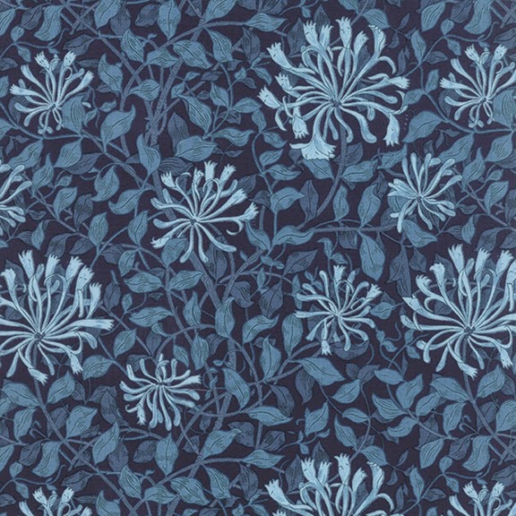
Honeysuckle in Indigo Blue
from my Best of Morris line for Moda

The number for Honeysuckle is 8115

Vintage Wallpaper Sample Book page 57: Honeysuckle, pattern #263

Like many Morris & Company patterns, Honeysuckle was designed as wallpaper. The Brooklyn Museum has a sample book from about 1915 that includes this swatch. 


The design has been attributed to William Morris's daughter May Morris.

Mary (May) Morris 1862-1938

May studied at London's South Kensington School of Design in the early 1880s. She is credited with the pattern in 1883.

Honeysuckle by William Morris 1876

Her inspiration may have been this print by her father done a few years earlier.

Root of the Mountains, 1890
A book from Chiswick press bound in the first Honeysuckle.


 May has lightened the design by focusing on one flower.

Read more about May Morris at the Victoria and Albert Museum website:


The first Morris collection we did at Moda in 2008
included this free quilt pattern for "Stepping Stone,"
a nine-patch quilt on point.


Betty made it with her collection of Morris prints
including several from that 2008 line A Morris Garden.


See more of Betty's William Morris quilt at this post:


See more about this new line Best of Morris here at Moda:


Wednesday, January 21, 2015

March Quilt Seminars & Conferences


We are lucky enough to look forward to several programs featuring quilt history in March on the east coast.

March 13 & 14, 2015 Friday & Saturday
Washington D.C., D.A.R. Museum.


A symposium will be held on Saturday March 14, 2015 in conjunction with the current quilt exhibit.


Eye Opening: New Research on Maryland and Virginia Quilts brings together historians, curators, conservators, and authors to present their latest research on quilts of the area.

Below are links to the DAR Museum's page and a post I did on the topic.
http://www.dar.org/museum
http://barbarabrackman.blogspot.com/2015/01/eye-opening-symposium-march-13-14-2015.html


The exhibit, Eye on Elegance: Early Quilts of Maryland and Virginia, will be up through September 5, 2015. Curator of Costume and Textiles Alden O’Brien examined 36 quilts from Maryland and Virginia,1790 to 1860. The themes: Design migrations and the many hands who made the quilts.

March 15-17, 2015 Sunday -Tuesday
Williamsburg, Virginia, Colonial Williamsburg


A textile symposium Stitching Together a National Identity, Sunday through Tuesday, March 15-17, 2015. "Through a series of formal lectures and juried papers, the symposium will address the question of what is American in American quilts, clothing, and needlework; provide updates on the latest research techniques and databases; and dispel myths about homespun and Yankee thrift." 

Detail of a cut-out chintz block from the collection of
Colonial Williamsburg


The current quilt exhibit at the Abby Aldrich Rockefeller Folk Art Museum, A Celebration of Quilts "features a dozen quilts that represent the diversity of quilts made in America from the 18th through 20th centuries. Several of the quilts are new to the collection and have never before been seen by the public."Through June, 2016.
http://www.history.org/history/museums/abby_art_current.cfm

March 28 & 29, 2015 Saturday & Sunday.
New York City

Empire Quilters are hosting a weekend of speakers during their quilt show Under A New Star at the Fashion Institute of Technology. March 28 & 29, 2015. Speakers include Paula Nadelstern, Roderick Kiracofe, Amelia Peck, Sue Reich, Elizabeth Warren & Barbara Brackman. See the program here:
http://www.empirequilters.net/shows.php?ID=67

Sunday, January 18, 2015

Pantone's Marsala Red in Best of Morris


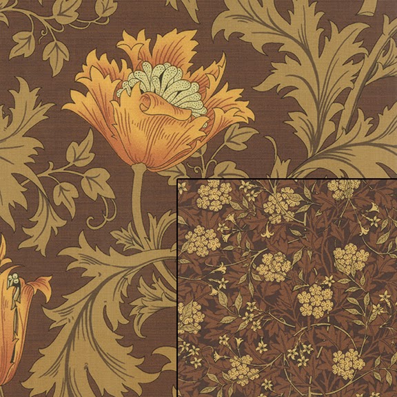
Red colorway of my Best of Morris line for Moda.
Yardage scheduled for delivery to shops in February

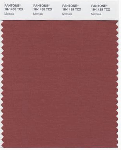
The Pantone Color Institute announces an annual color trend. 
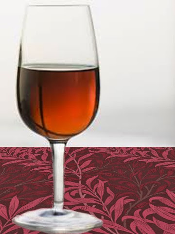
Marsala is the shade for 2015.


I'll drink to that.

"Much like the fortified wine that gives Marsala its name, this tasteful hue embodies the satisfying richness of a fulfilling meal while its grounding red-brown roots emanate a sophisticated, natural earthiness. This hearty, yet stylish tone is universally appealing and translates easily to fashion, beauty, industrial design, home furnishings and interiors."
It's probably no coincidence that my 2015 Morris reproduction prints in the Best of Morris collection feature a red colorway. When we plan a line a year or so before it shows up in shops we consider trending colors, which is also how Pantone picks their color of the year.

Leatrice Eiseman Executive Director of the Pantone Color Institute, explains:

"I look for ascending color trends, colors that are being used in broader ways and broader context than before.."

In each Morris reproduction fabric collection we design we include colorways that echo William Morris's use of natural dyes.

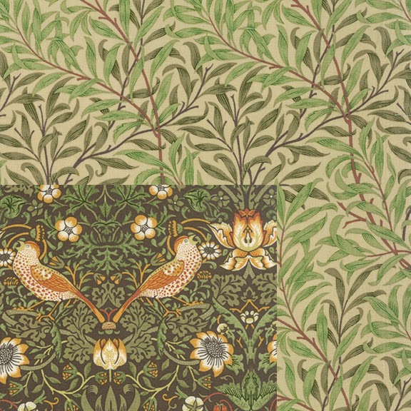
We usually include a sage green,

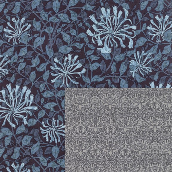
an indigo blue

and an earthy brown

and then we choose a variable....
yellow, black, teal, lavender...
or red.

I don't do this design alone so it may be that the Moda designers who coordinate colors throughout their entire line of all their designers also saw an increase in interest in red. 

Moda's Bella Solids
Tomato Soup, Kansas Red

They probably know about the Pantone Color of the Year way before the rest of us do too.


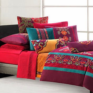
I get my ideas of what people are buying and will want to buy from decorating magazines, store windows and the bedding department at the Macy's in Kansas City.


Sometimes I'm right and sometimes I'm wrong.
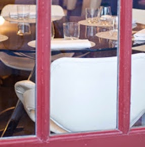
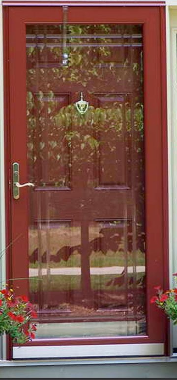
My new storm door matches this Parisian restaurant window.
I still don't know if that was a good idea.

Who are these Pantone people who set color trends? The company makes a color matching system. The "Color of the Year" is an excellent hook to hang a story about color on.


 When I started designing for Moda I had a Pantone sample book and so did the designers at Moda. 


I'd tell them to match #18-1436 and they'd look it up in their book.
It worked well.

Now we do it differently---computer design is calibrated to Pantone systems. And I mostly use Moda's own Bella Solids system to describe color.


Meanwhile, I feel better about that storm door. When somebody says "Why?" I'll say: "It's the color of the year."