QUILTS & FABRIC: PAST & PRESENT


Friday, September 30, 2011

Misdated Quilts


Dated quilts are helpful in training the Quilt Detective's eye.
But once in a while the date is wrong. This quilt, found in an online auction, is NOT from 1876.

The color scheme and the individual cottons offer good clues to the actual date when it was made---about 1890-1920.

Two of the easiest clues for a novice detective to learn are that the wine-colored red prints and the black-on- white prints above were a fad from about 1890-1920.  The red, which the dyers called cerise (French for cherry) and the marketers called claret, was quite popular around the turn of the last century. Characteristics are simple white figures on a wine-colored background.

The black and white prints (a true black) like the one above were not possible until about 1890 and were very fashionable in the first decades of the 20th century. This quilt, also recently in an online auction, is most likely 1890-1920. 
The pattern---Jacob's Ladder or Underground Railroad---was also very popular in the 1890-1920 decades.

Some of the fabrics, like a white dot on indigo, are no help in dating---too popular for too long. But the blacks and the wine-reds are excellent clues.

The black-and-white prints often read as gray. They were sometimes called mourning prints 100 years ago.

Someone (I'd guess the same someone) added the dates much later, probably using family history as the basis for her guess rather than any knowledge of when cotton prints were available. Another clue---black embroidery thread not used in the 1870s.

A very weak clue to date is the stitch used in both quilts. It's the way I embroider---what is that stitch??? A directionally-challenged chain stitch???


A better chain stitch that was probably actually embroidered in 1879

That crabbed stitch in black thread seems very "late-20th-century", but don't rely on that stitch as a basis for dating a quilt. Fabrics are your best clues. And the fabrics in the misdated quilts are 20 years later than the dates.

Tuesday, September 20, 2011

Pillar Prints

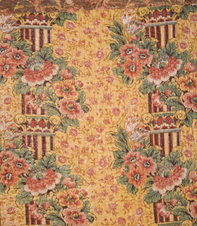
A mockup of the pillar print in my Lately Arrived From London repro collection. 


Every early 19th-century reproduction collection needs a pillar print.

Pillar prints were popular in the early 19th century when new dye ideas
 enabled printers to put bright color next to bright color.

The designs echo the classical architecture of ancient Greece and Rome with stripes assuming the form of fluted columns interrupted by ornate capitals and garlands of flowers.


A tea-ground chintz print from about 1815.
 The reds here were probably printed by copper cylinder,
 the blue, yellow and overprinted green added by blocks or hand.

Other names for the style are “architectural prints” or "columnar prints."

Monochrome patriotic print.
One indication of a roller or cylinder printed fabric is the short repeat.
 Roller-printed design repeat about every 15 inches.
If this were printed with a larger copper plate
the repeat would be over twice as wide.

The term "pillar print" seems to be rather recent, a mid-twentieth-century name. The earliest reference I have found by searching Google's digitized books is in a 1956 British publication. The term is more commonly used to describe Japanese wood blocks on paper, in which a pillar print (hashira-ye) is a long, narrow print meant to hang from a wooden pillar in a house.

Detail of a whole cloth quilt.
Stripes inside a stripe.
Pillar prints were popular for decorating before 1830 or so.

Florence Montgomery noted an English printer's mention of a chintz with pillars and garlands in a 1760-62 notebook, which may be the earliest reference to the design idea in a print, but surviving examples printed with woodblocks date only to the end of the 18th century. The pillar prints we come across in American quilts tend to be from about 1800-1830 and usually printed by a roller.

Stripes pieced into strips. Two different prints in a strip quilt.

The same pillar print as above but a different colorway.

And another colorway.


 English museum curator Peter Floud wrote a series of articles for The Magazine Antiques on "English Printed Textiles" in 1957. He examined four English printers' pattern books in the collection of London's  Victoria and Albert Museum and the Musee de l'Impression of the Societe Industrielle at Mulhouse, France. Floud's conclusions remain the standard scholarship fifty years later.

"The pattern books show that [pillar prints] enjoyed two quite separate spells of popularity; the first between 1800 and 1808, when a very large number of polychrome block-printed pillar prints were turned out by all the leading English printers; the second between 1825 and 1830, when it was revived as a vehicle for some of the finest roller-printed designs ever produced. It appears in both cases to have remained a purely English phenomenon, without any parallel among French printed fabrics."

Architectural prints were popular with American quilters
 between those two periods of production.

At top of this photo the document print for the pillar print
 in the Lately Arrived from London reproduction collection.
At bottom a tea-ground and a white-ground colorway.

A utilitarian four-patch with a
 pillar print in the border along the top.

For the quilt detective looking to date a quilt rather than a piece of fabric the best estimate might be range of 1800-1860. The fabric may have been unfashionable for interior decoration in the 1840s but quilters continued to salvage patches from their old drapes for decades.


One does not often come across pillar prints in borders and strips,
 but look for them as scraps.

Quilt from the Spencer Museum of Art, about 1830.


Several years ago Terry Thompson and I
reproduced this print for a Moda reproduction collection.
Above is the document.

Here's the reproduction with a chocolate ground.
Buy 5 or 6 yards when you find these pillar prints as they make terrific borders for quilts copying an early 19th-century look. [I always tell you to buy 5 yards, but better to be safe than sorry.]
Kathy Ronsheimer didn't buy ENUFF,
so she had to cut the pillar in two for a border for her
 version of Jeana Kimball's Old Voices New Impressions sampler
But it all worked out nicely, don't you think?

Click on the link to see Florence McConnell's reproduction quilt using a pillar print
http://www.americanquiltstudygroup.org/qs_star_study05.asp 

Saturday, September 17, 2011

Chrome Orange: Background and Accent

Flavin sent a snapshot of a quilt with an unusual pattern.
She thinks it's from Alabama.

It's not that the piecing is unusual, it's just a star made of diamonds, but the shading and the way the star is finished off as a circle seems unique.
Several characteristics indicate it's a Southern quilt from the end of the 19th century.
  • The fan quilting (see it in the border.)
  • The wide sashing pieced of strips
  • The color scheme of solids with chrome orange as the neutral or the background. (See the last post for a Carolina applique with a yellow ground.)

Not that Southerners were the only quilters who thought chrome orange made a perfect background.
Here's a Pennsylvania quilt from an on-line auction. Women in southeastern Pennsylvania  used a lot of the shade between 1875 and 1925.

Shades of reddish-brown solids are sometimes used as a substitute for a brighter, more expensive red. 

The idea of yellow-orange as a background continued into the 20th century. Purple and yellow---perfect complements. (Mid-20th-century yellow golds are dyed with other dyes. Chrome is poisonous and not used in the U.S. anymore.)
Chrome orange in a Whigs' Defeat design.
 (The South? Mid to Late 19th century?)
That pieced sashing and the large blocks on the square makes me think late-19th century.


The fabric also made a terrific accent color.

More Pennsylvania


Berks County, Pennsylvania

This one could be from anywhere.

Do a web search for:

 chrome orange reproduction quilt

and you will come up with some sources for this shade in solids.
Buy 5 yards....You need it.
(I know, I'm an enabler.)

See more quilts with chrome orange from the Quilt Index
This one from Iowa is probably end of the 19th-century rather than Civil-War-era as the family thought.

From the DAR Museum

From Quilts of Tennessee

From the New England Quilt Museum

And view my posts with chrome orange quilts here:


Thursday, September 15, 2011

Northern Lily/Southern Rose Block 7

#7 Carolina Rose
By Ilyse Moore

The seventh block of the Northern Lily/Southern Rose applique block is based on a pattern seen in North Carolina. Ilyse used reverse applique for the center line on the leaves in her version.

Characteristics of this rare regional design include an unusual symmetry based on a single central flower topped by a triple floral. The leaves framing the floral are large and often serrated.  I gave it a  number--- 31.99 in my Encyclopedia of Applique. No one has had a family name for it.


Detail of one made in Alamance County,
North Carolina by Nancy Spoon Schoffner,
mid to late 19th century.

When the North Carolina Quilt Project published their book North Carolina Quilts in 1988 they had documented only four quilts in the design, all from adjacent Alamance and Guilford Counties. Since then more variations have been found.

By Susan Stiff
These are the kit prints from Civil War Reunion and the Bella Solids from Moda.

See Nancy Spoon Schoffner's version at the Quilt Index by clicking here:
And another version (courtesy of Kathy Sullivan) on a post last year by clicking here:


By Barbara Brackman

I used a Bella Solid yellow for the center line and did regular old applique.
I placed the block on the square to go with the other blocks in the quilt. If you wanted it to look more like the North Carolina originals you could line the stem and pot along the diagonal. You'd need to make the block larger too---Maybe 16" or 17"


By debi schrader
debi focus-cut the Union print from Civil War Reunion for her pot and did reverse applique on the leaves to let the crinkly linen-like background through. I had seen an antique quilt with the tiny pot so added that and simplified the original for the pattern.

A strange composition from the end of the 19th century.
The serrated leaves and triple floral have something in common with that Carolina pattern.

You can find the pattern and the kit for my applique sampler by doing a websearch for Northern Lily Southern Rose Moda.

Monday, September 12, 2011

Strike-Offs and AQSG Donation

Some of the strike-offs from Lately Arrived From London


Strike-offs are like proofs. Once the printers have cut the screen they try different combinations of the colors selected for the collection. The designers then choose the ones they think work best. Some work well and some don't.


Some like this blue chintz work GREAT, but they don't really go with anything else in the line.
Editing these out is like editing one's prose. Ouch! That was a great print---but the only blue-and-white-toile looking piece in there. We'll do something similar again some time.

When we are doing a reproduction line we also have to edit for accuracy. That pink pillar print at top left above is interesting, but it just doesn't look like the kind of pinks you'd have in 1810---so it gets the heave-ho.

And the olive greens on the left. The greens work fine as an accent color but not as a background. Just not done in 1810. Goodbye, greens.


We started with about 70 variations on 8 prints and by process of elimination we wound up with 28 skus (a sku is jargon for a colorway of a print).

Only 28!---well I forgot to mention that economics is also a motivation. We'd decided this would be a small line. Some of my repro lines go up to 42 skus. Why small? Early 19th-century reproduction prints are a niche market. You readers are probably part of that niche---it's a sophisticated niche.
Another reason: If we'd do 50 skus shop owners would say they couldn't afford to buy the whole line. And they'd be right.

So that's the explanation as to why there are no blues, pinks or olive greens in the Lately Arrived from London collection. Design, accuracy and economics.
But what about all those small pieces that were eliminated? Unused strike-offs usually go into the recycle bin but I weasled these out of the boss. For a good cause.


I asked my friends to make 16 patches and asked Bobbi Finley to set them with the larger chintz scale strikeoffs for a quilt top pieced of fabric that was only printed once. We filled in with yardage that was printed---and some from other sources.


So here is a top made of fabric that nobody else in the whole world has.

We added a border of the pillar print from the yardage.
And we are donating the top and a bag of scraps left from the strike-offs to the American Quilt Study Group's Auction that will be held at their annual seminar September 21-26 in Cherry Hill, New Jersey. AQSG benefits and you can go home with a top made of truly one of a kind prints or a small stash to make your own.

See more information about the American Quilt Study Group seminar here:

The benefit auctions, silent and otherwise, are always terrific.