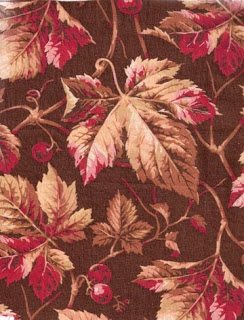
Cretonne, about 1880
Chintz and cretonne are names for similar fabric, large-scale furnishing prints.
Chintz about 1840
They are really just synonyms, names popular for furnishing fabric at different times, with chintz the earlier word. Once "chintzy" became a synonym for cheap, the fabric marketers changed the name to cretonne.
Cretonne as a French word had a
sophisticated air about it.
The Quilt Detective has to learn the difference between the earlier furnishing prints and the later versions: chintzes and cretonnes.
Star quilt about 1830, sold at Pook & Pook auctioneers.
Star quilt about 1890
Photographed by Sue Garman at Houston Quilt Festival
A century ago in House Beautiful magazine, Virginia Robie tried to explain the difference:
"The terms chintz and cretonne are often used interchangeably. Chintz is a cotton cloth, printed with flowers and other devices, in a number of different colors, while cretonne is a cotton cloth either plain or printed on one or both sides. Chintz is either glazed or unglazed: cretonne is always unglazed. Cretonne was originally a strong white fabric with warp of hemp and woof of flax. It was named from the village of Creton in Normandy."
Not much help.
I have seen late-19th and early-20th-century prints with a glaze.
I have seen very early 19th-century prints without the glaze (it washes out.)
Perhaps the easiest way to distinguish between an early chintz and a later cretonne is by the print style.
Here are six clues to the date:
1) Furnishing fabrics printed in the first half of the 19th-century and earlier often have a white space between the background and the figure. See the "halo" in the above bird print.
Late-19th century furnishing prints rarely have halos unless
the designer is trying to copy an earlier print.
The background and the figures register (overlap) quite neatly.
2) Earlier prints often have registration problems, in which the greens and blues in particular are printed a little off, so the leaf outline is a 1/4" or more away from the leaf.
Late-19th and early-20th century prints have
excellent registration.
unless the designer is copying an earlier style.
3) Early prints might have a figured background behind
the figure ---a fancy ground.
Later prints rarely have printed backgrounds.
4) Earlier prints often show over-printed greens in leaves and stems, that is, yellow and blue printed atop one another to make a green.
You don't see that overprinting in later cretonnes
and the greens are much more olive than blue-green or lime-green.
5) The drawing style in earlier prints tends to be simpler, often with a heavy outline.
The later cretonnes tend to more elaborate florals with
color defining the shape.
6) And the later prints have a tendency to be more mannered,
odder,
And more sentimental....
See two other posts I've done about cretonne here:


QDBDg~~60_12.jpg)


M)DpOI5BMZMIHvgzQ~~_3.jpg)


