QUILTS & FABRIC: PAST & PRESENT


Friday, November 30, 2012

Lollypop Trees: Interpretations

Tree sampler, attributed to New York, 1850s
in the Quilt Engagement Calendar 1975 from
America Hurrah Antiques

A reader recently asked about the idea of lollipop flowers and trees so I digitally dug through my files to see what's in there. How old is the idea of a simple lollipop shape---simple circles as shorthand for flowers and fruit?  The first thing I thought of was the quilt above.

Juniper & Mistletoe
by Karla Menaugh
 
I put a stickynote on that page of the Calendar years ago because it caught my eye.
 

The quilt appeared again in the Quilt Engagement Calendar Treasury with the caption by Cyril Nelson:
"this jeu d'esprit [flight of fancy] might aptly be called Lollipop Trees. I have yet to see another quilt that can match its delightful whimsy."
 
A vintage record cover with a Lollipop Tree
 
Here are some recent interpretations of that quilt. Nelson's name Lollipop Trees stuck---sometimes spelled Lollypop.
 

Pom Pom Tree by Wendy Whellum
at the Adelaide Quilt Show in 2009
 
Wendy Whellum interpreted the antique quilt with a bright blue zig-zag set. See her blog Legends & Lace here: http://legendandlace.blogspot.com/
 
Somewhere I found this reproduction, probably made in the 1970s when the quilt photo first came out.
 
Once Kim McLean and Liza Lucy began working with the idea their pattern became a big hit.


Lollypop Trees by Kim McLean
 
The Kaffe Fassett fabrics and color sense
 updated the whole look.

Chocolate Lollypop Trees
by Liza Lucy

Juniper & Mistletoe
A Festival of Trees
by Karla Menaugh
 Karla and I had a different take on the same kind of trees.
 
 
We found simple, whimiscial trees from several antique quilts for this sampler.


We substituted stars for the dots in several blocks
 
Next post---more on the history of the lollipop shorthand image for trees and flowers.

Find a pattern for Kim McLean's Lollypop Trees here:
http://www.gloriouscolor.com/store.php?cat=128


Buy Juniper and Mistletoe: A Forest of Applique by Karla and me by clicking on the book cover over on the left hand column. Or click here:

http://www.amazon.com/dp/1935362283/ref=as_li_tf_til?tag=barbbracsmate-20&camp=14573&creative=327641&linkCode=as1&creativeASIN=1935362283&adid=0DS9T1Q0A26SN6TWVPW8&&ref-refURL=http%3A%2F%2Fbarbarabrackman.blogspot.com%2F

Tuesday, November 27, 2012

John Henry Dearle: The Morris Apprentice

Seaweed by J.H. Dearle
from the Morris Apprentice collection from Moda
 
The Morris Apprentice is a new reproduction William Morris collection that celebrates the master's apprentice John Henry Dearle.


In the late 1870s the 18-year-old art student was hired as a showroom assistant. Twenty years later he was Head Designer putting his own stamp on Morris style.
 
The prints reflect Dearle's new directions. He added color and line from art nouveau in designs like "Artichoke."


And devised pattern repeat with eastern influence in the more formal "Eden." Dearle became Art Director in 1896 after Morris's death, guiding Morris and Company into the twentieth century.

Pictures of Dearle are rare.
 Here is a digitally enhanced photo.
The original I believe is in the Huntington Library collection.
 
Morris and Company designed a wide range of arts and crafts, including hand-knotted carpets, woven tapestries, wallpapers, printed fabrics, embroideries and stained glass windows. Henry Dearle (1859-1932) was instrumental in many of these designs.
 
William Morris has often been credited with the design for Seaweed,
even though it dates to five years after his death.
This 2012 British stamp celebrating the firm's anniversary
gives Dearle the proper credit.
 
Dearle was always secondary to Morris in the public eye. Although he did much of the design work for Morris and Company, he's received less credit than he deserved---or perhaps wanted. His designs were often attributed to Morris, even after Morris's death.
 
His modesty makes a biography beyond the bare bones difficult. John Henry Dearle was apparently born in London to William Dearle (1832-?) and Louisa Dearle on August 22, 1860, baptized in St. Pancras Church on the Euston Road.
 
St. Pancras Church looks much the
 same today as it did in 1860.
  
Dearle's father was listed as an artist, a mechanical draughtsman, in the 1881 British census. Henry, the second son, studied at the West London School of Art and began working at Morris & Company, first in the glass painting department and then as a tapestry weaver.

Dearle worked in the weaving workshop at Merton Abbey
 
John William Mackail's The Life of William Morris in the 1911 edition contained an addendum  (presumably written by Dearle) stating that
"Mr. J. H. Dearle entered the service of the firm very young from a post in an insurance office for the sake of more congenial work. He was employed for several years in the glass-painting shop, and was picked out by Morris to help him in rediscovering the lost art of high warp tapestry, and restoring it to practice. Later he was the chief designer (under Morris) and manager of the Merton Abbey works, and became a partner in the firm in 1894."
 
At 27 he began designing tapestries. In the 1880s William Morris's interest lay in politics and printing books so the young man took over more and more of the designing. Morris died in 1896 and Dearle became Art Director.
 
The Tate Britain in London has an exhibit
with two of the Holy Grail series of tapestries that
were collaborations between Dearle,
William Morris and Edward Burne-Jones.
 
In 1908 International Studio, a design magazine, explained the shared work on the woven tapestries that Morris and Company is famous for. Edward Burne-Jones drew the figures; "the accessories being arranged, at first by Morris himself, subsequently by his gifted pupil. Mr. J. H. Dearle." An example given: an 1885 Floral panel for which Morris did the human figures. "For the present scheme of colouring and background of flowering plants Mr. Dearle is responsible."
 
Detail of the flowers in the Holy Grail, Dearle's design,
the "accessories"
 
In the 1908 issue of  International Studio
the Angeli Ministrantes tapestry from 1894 is captioned
"Designed by J.H. Dearle. Figures by E Burne-Jones"
 
Another version.
Burne-Jones often gets full credit today.
 
Edward Burne-Jones & William Morris 1890
After their deaths in the late 1890s
Morris and Company continued for almost fifty years.
 
Dearle married, possibly to Kezia E. Dearle in 1883, and there is a record of one son, Duncan William Dearle, born February 21, 1893 in Upper Tooting, Graveney, Wandsworth, Surrey. Henry and Duncan collaborated on stained glass windows in the early twentieth century, carrying on the tradition of Edward Burne-Jones, the major glass designer at Morris from 1861 to his death in 1898.
 
The theme of the Winnicott Memorial Window is literature.
Notice the characteristic florals in the side borders

One Dearle window recently restored is the Lady Winnicott Memorial Window at Plymouth Central Library which was dedicated in 1927 at Plymouth in Devon. During World War II the library was destroyed by German bombers but the stained glass had been removed and stored. The library was rebuilt; the windows reinstalled in 1955.

See the Morris Workshop's tapestries in the Tate Britain exhibit Pre-Raphaelites: Victorian Avant-Garde, which will be up until January 13, 2013.
Read John Henry Dearle's Contribution to Morris & Co. by Lesley Baker by clicking here:www.morrissociety.org/publications/JWMS/W02.15.1.Baker.pdf
Read in this Google Preview of Art, Enterprise and Ethics: The Life and Work of William Morris, a memoir of the Morris Company by George Wardle:
 
Dearle replied to that memoir with a one-paragraph autobiography: "Mr. Wardle, writing many years afterwards, has fallen into a good deal of confusion from imperfect memory...." See it as almost a footnote on page 47 of the 1911 edition of Mackail's The Life of William Morris, Volume 2.
 

Tulip from the Morris Apprentice collection 
echoes the tapestry "accessories".
 

Saturday, November 24, 2012

Flack Quilt Collection Auction


Those of you who follow the online auction world may have bid and won a few of these spectacular quilts from the folk art collection of Mr. and Mrs. Paul Flack.
They were auctioned in a 12-day event at Pook and Pook Auctioneers in Downingtown, Pennsylvania.
The Flacks displayed many of their quilts this year at the Mercer Museum in Pennsylvania.

 I have picked a few late 19th-century Pennsylvania quilts to show you.
No captions---they are just great Pennsylvania quilts
---late-19th century, possibly early 20th century.
 You can see the auction results here:
 There were 413 items, not all quilts but all impressive folk art.


Wednesday, November 21, 2012

A Visit to William Morris & Company


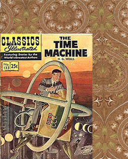
If I had a time machine there are lots of places I'd go, mostly involving shopping expeditions.
 
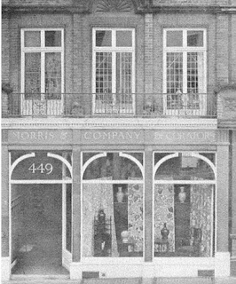
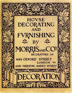
One stop on the itinerary would be 449 Oxford Street, London
about 1880
 
I'd drop by Morris and Co. to buy some wallpaper,
 fabric and a few rugs.
 
I would not set the dial for June 1, 1873 because Clover Adams from America would be in the store, shopping for the same things. She was not pleased with what she saw and wrote her father:
 
"Morris rather bores me; is getting affected in style."

Clover (Marian) Adams and her dog
 
Then she asked about the wallpaper's reputation for poison green or some coloring agent with a little arsenic in it.

"I said 'arsenic' and the salesman coolly replied, 'If you wish them without arsenic you must pay more for them!'

Nice comeback.
 
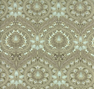
Eden in Sage Green
 We do not use poison greens in our reproduction prints!
 

Then she tells her father:

"I've asked Bumstead who is here to blow up the poet."


By the poet we can assume she means William Morris. Her reaction seems a bit overblown.

I am never going ANYWHERE with Clover Adams. We would undoubtedly get into a heated discussion about interior design.

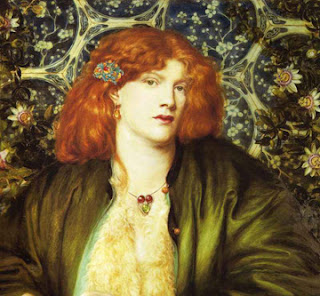
Six years later she and husband Henry are back in London, invited to a reception at the Royal Academy where
 "every art rag-bag seems to have been ransacked to adorn the women....

Pre-Raphaelite style by Dante Gabriel Rosetti
"Art Rag Bag" Style
according to Clover.
 
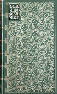
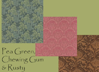
"...They look like illustrations in Christina Rosetti's Goblin Market---fat fugues in pea-green; lean symphonies in chewing gum color; all in a rusty minor key."

 
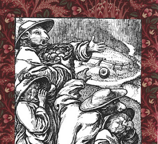
Clover is referring to poet Christina Rosetti's 1862 poem Goblin Market, about two sisters and their goblins, illustrated by Christina's brother Dante Gabriel Rosetti in Pre-Raphaelite style.

Goblins
And just who is she calling fat?

Well, each to her own taste. I'd trade my best Fiestaware bowls for a chance to go to a Pre-Raphaelite
party in 1879. And I like pea-green.

3 colors from my new Morris Apprentice line
called Fennel Green, Red House Red and Cocoa Brown
 
If you---unlike Clover Adams---appreciate William Morris style, you will want to be buying yardage from my Moda Morris Apprentice collection when it comes into the shops this month. It never lasts long.

But some things do last. I believe you can still shop at
449 Oxford Street, same building.
They just don't sell the same things anymore.
 
And while you are in London you must visit the Tate Britain gallery
where an exhibit Pre-Raphaelites: Victorian Avant-Garde is up until January 12, 2013.
 

More about Marian Hooper Adams:
Actually, Clover Adams was a very interesting woman, smart, talented---iconoclastic as you can see by her attitude towards Morris design---but cursed by family depression (she and several other family members were suicides).

See a portfolio of her photographs at the Massachusetts Historical Society here:
http://www.masshist.org/features/clover-adams/album8

And read her letters
The Letters of Mrs. Henry Adams. 1865-1883. Edited by Ward Thoron. Boston: Little, Brown and Company, 1936.
The letters quoted here are on pages 116 and 151.