QUILTS & FABRIC: PAST & PRESENT


Saturday, October 29, 2016

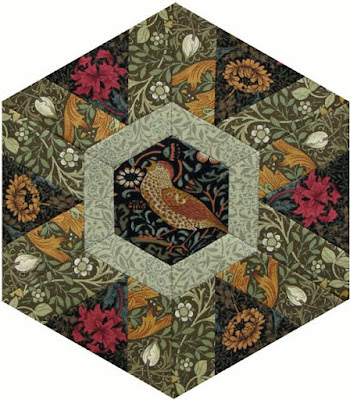
Morris Hexathon 26: Floating Clouds


Morris Hexathon 26: Floating Clouds by Becky Brown
She says she's finished her first marathon.

A little Photoshopping of the Salt Lake Marathon.

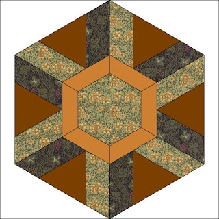
Our last hexie is Floating Clouds, a hexagonal block from the 1930s given the name in the Kansas City Star.

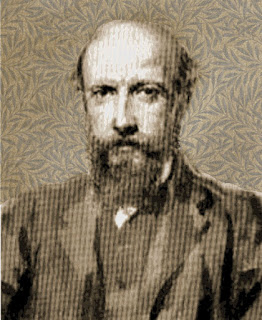
Philip Speakman Webb 1831-1915

It's a good pattern to recall architect Philip Webb, one of the Morris circle, a life-long friend and partner in design, whose most famous house is called Clouds.

Webb and Morris met when both worked for London architect George Street as young men. Morris quit architecture to become a painter, and then a designer, and then a political activist, etc. But Webb pursued a successful career designing arts and crafts commercial, ecclesiastical and residential buildings.

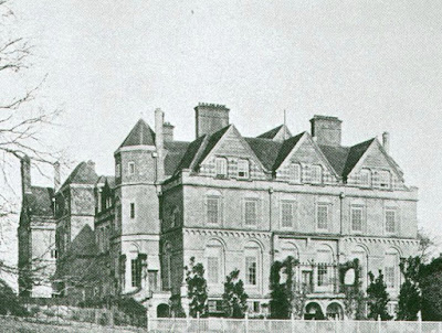
Clouds House in Wiltshire

Webb's idea about integrating a building into its environment was a hallmark of arts and crafts architecture. The building should look like it it had evolved from the environment. Clouds is his largest project, built for Percy and Madeline Wyndham about 1880.

He designed the Red House for William Morris himself about 1860. Their tandem thinking is illustrated by the fact that they were the two founders of the SPAB, the Society for the Preservation of Ancient Buildings.


Webb designed Standen in West Sussex for James and Margaret Beale in the 1890s, his last commission. It's a National Trust Property open to the public so the last stop on our cross-Britain marathon.
http://www.nationaltrust.org.uk/standen-house-and-garden

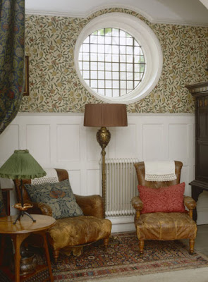
Standen is dressed to look as it did in 1925 featuring the Morris wallpapers, rugs, embroideries and details.

Light fixture at Standen by Webb

The Morris Firm, first called Morris, Marshall, Faulkner & Company, had seven principal partners.
Ford Madox Brown, Edward Burne-Jones, Charles Faulkner, Dante Gabriel Rossetti, P. P. Marshall, William Morris, and Philip Webb: "Fine Art Workmen in Painting, Carving, Furniture and the Metals."

Webb designed furniture and accessories for Morris, Marshall, Faulkner & Company while incorporating their decorative items into his architectural commissions.


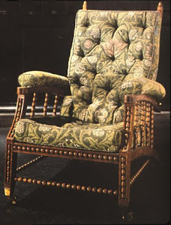
Perhaps the most notable: the adjustable Morris chair,
which Webb designed in the 1860s.

Morris Hexathon 26: Floating Clouds by Ilyse Moore


You need 5 pieces, a hexagon, a tumbler, a triangle
and a parallelogram flipped.

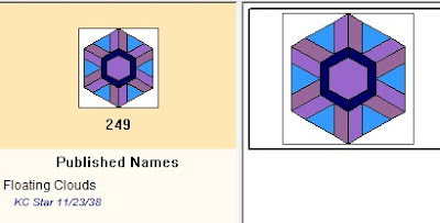
BlockBase #249

This week's quilt pattern was published in the Kansas City Star in November, 1938.
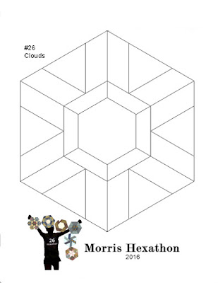
Pattern for an 8" Hexagon
(4" sides)
To Print:

  • Create a word file or a new empty JPG file that is 8-1/2" x 11". 
  • Click on the image above. 
  • Right click on it and save it to your file. 
  • Print that file out 8-1/2" x 11". The hexagon should measure 4" on the sides.
  • Adjust the printed page size if necessary.
  • Add seams when you cut the fabric.

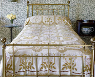
The Willow bedroom at Standen.
We can assume Margaret Beale and her
daughters embroidered the coverlet.

Clouds House is not open to the public. The house figured in many romantic tales of the Bloomsburies and Arts and Crafts notables. John Singer Sargent painted the Wyndham's daughters in 1899.

The Wyndham Sisters, detail.
Collection of the Metropolitan Museum of Art

Those Wild Wyndhams by Claudia Renton (2014) tells their stories.
Read about Standen here:
http://www.periodproperty.co.uk/ppuk_discovering_ppom_201004.shtml

See more of Margaret Beale's embroidery here
https://nttreasurehunt.wordpress.com/2011/06/10/william-morriss-influence-at-standen/

And read about Clouds House in this study of arts and crafts architecture by Caroline Dakers: Clouds: Biography of a Country House. See a preview here at Google Books.
https://books.google.com/books?id=gbTd5_RuzisC&printsec=frontcover&source=gbs_ge_summary_r&cad=0#v=onepage&q&f=false


One More Inspiration


A set for a simple star hexagon from the 1930s.

It's set in strips. Strips of hexagonal star blocks next to strips alternating
orange and white unpieced hexagons.

WE MADE IT!
26 Blocks!
26 Weeks!

Thursday, October 27, 2016

Turkey Red Tour


I recently attended Deb Roberts's Turkey Red Tour at the the International Quilt Study Center & Museum. I enjoyed myself and learned a lot, not only from the lecturers and tour leaders but from other attendees. Getting to discuss the color at length was informative.

We all "ooh-la-la"ed over this butterfly print
that Madame Jacqué showed us.

Our first lecturer was Jacqueline Jacqué, retired curator at the Musée de l'impression des étoffes à Mulhouse, which translates as Museum of Printed Fabrics in Mulhouse, France.


Reverse-appliqued feather border with a multi-colored Turkey red print.

Turkey red was quite popular with American quilters from
about 1840 to 1940.

Let me tell you what I learned (a good excuse to show a lot of details of the fabulous IQSCM collection at Quilt House in Lincoln, Nebraska.)

First I'll tell you what I already knew.

Turkey red on the left\madder red on the right

The dyestuff is madder root, which rather easily produces a brownish-red. Vivid reds were hard to obtain in cotton. A complex process for madder dyes was first developed in Middle East. Early European efforts focused on plain reds obtained by dyeing the cotton in the yarn, then weaving it into solids.


Thus, the background for Turkey red prints was always red. The sophisticated printer could discharge (bleach out) white and add yellow, blue, green and dark brownish-black figures.

This early-19th-century print shows a rather primitive discharge technique.
The yellow blob was bleached out and at the same time the
mordants for chrome yellow were added. The black
could be applied atop the Turkey red so required no discharging.
Those blacks could be Prussian blue or madder brown that read as black.

The simplest Turkey red prints were discharged white figures or overprinted blacks. Daniel Koechlin-Schouch of Mulhouse developed techniques to add yellow figures in the discharge process (Madame said that happened in 1821).


Thereafter printers developed increasingly complicated processes to add blue, green and black figures to the Turkey red background. Mills specialized in Turkey reds. Towns in England, Scotland, France and the German and Swiss states were home to Turkey red workshops and factories, but the process apparently was not done in the United States until after the Civil War.

Turkey red solids are hard to date---
We see them in American quilts from 1840-1940.
This detail is a pieced bloom in a border.

See a post on the early Turkey red prints at my Civil War blog.
http://civilwarquilts.blogspot.com/2015/01/stars-in-time-warp-1-multi-colored.html


Madame Jacqué reinforced some of our American ideas. American mills did not dye or print Turkey red until after 1869 and the invention of a synthetic alizarin---the coloring agent from madder.

A charm quilt from about 1900 has
several simple Turkey red prints like the polka dot,
 probably American produced,
(end of the 19th century and into the 20th).

She also said that she knew of no Turkey red industry still active anywhere in the world. Synthetic reds (not ALWAYS colorfast) have replaced the old and expensive process.

Koechlin figured out how to dye cotton Turkey red
in the cloth in 1809. I had always assumed they continued to dye it in the yarn
and then weave it.


Madame showed many slides of complicated, lush prints like the butterfly print, which you can buy as a scarf from the Museum shop. But we don't see these in American quilts. Was it a matter of taste?Did quilters in the U.S. prefer simpler calicoes? Or were these more luxurious prints that Alsace did as a specialty too expensive?

One of the more complex prints we saw was in
the sashing of this sampler.

Did we import few actual French prints from Mulhouse,
the French center of Turkey red production?


It may be that Americans imported their red prints from Scotland, which began extensive Turkey red printing about 1830. We do not see Turkey red in American quilts till about 1840 and then there is an explosion of interest. I'm beginning to think our reds were Scottish imports and not French, although the style is certainly French.

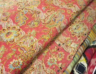
Reverse of a Uzbekistani bedcover

Madame also talked about Russian printing of Turkey red, which may be the source for fabric in the 20th-century Turkey red bedcoverings we saw from Asia, places like Uzbekistan and Turkistan. IQSCM has quite a collection of these textiles. 

Xenia Cord gave a lecture on What Is It if It's Not Turkey Red?, a discussion of the synthesizing of the coloring agent in madder, called alizarin, and the unreliable copies that plagued quiltmakers from about 1870 into the 20th century.

Xenia and the ELI quilt

Congo red, a direct dye, was developed in 1884 and we learned quite a bit about the complicated trade and innovation in the German chemical industry. 

Detail of the ELI quilt from Ohio's Miami Valley,
dated 1894. The pinkish album block at top right
may have been dyed with Congo red, once as bright
as the Turkey reds in the other blocks.

Once alizarin was developed all the other processes in creating the Turkey red color were also synthesized and speeded up. A process that might have take a month in Mulhouse in 1820 and involve chemicals derived from sheep dung and human urine could be accomplished in hours with test-tube copies. In discussion our consensus was that even though this was an industrial process it was still essentially the same chemistry and the later red prints are technically Turkey red.

Quilt dated 1865

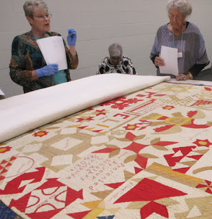
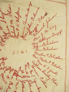
We saw a 1917 Red Cross quilt which Joan,
the volunteer who does genealogical research on the many Turkey red signature quilts,
said had Iowa names. It did not take me long to find my boyfriend's relatives.
The Mrs Kathryn Bringolf in this block is his grandmother's grandmother.
Another attendee found her uncle's name.

Thanks to Deb Roberts, the staff at the International Quilt Study Center and Museum, and the visiting lecturers Julie Silber, Madame Jacque and Xenia Cord for a wonderful tour.

We couldn't figure out what that pink and red
on the bottom was but now I'm guessing
it's a double pink---a strange double pink on a large scale.
It was definitely more pink than red.

Links to the museum in Mulhouse (pronounced Muh-looze with an accent on the last syllable----Don't you French readers laugh at us cause we thought it was Mull-House for years)

https://www.facebook.com/lesamisdumusee/posts/615903421915377
http://boutique.musee-impression.com/935-carre-de-soie-papillons.html

Tuesday, October 25, 2016

Baltimore Blues: Patterson Park

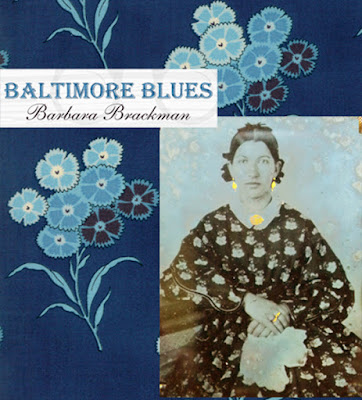
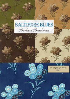
Baltimore Blues is my latest Moda reproduction print collection.

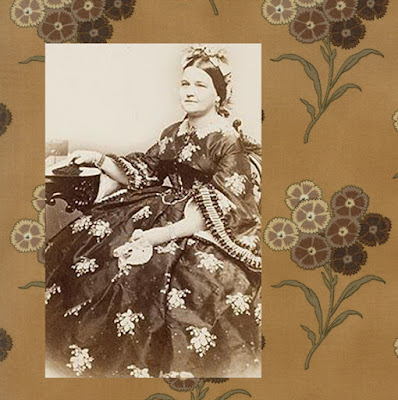
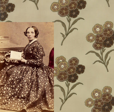
The largest print in the line is a floral ---the sort
of splashy floral someone like Mary Todd Lincoln might
appreciate (although Mary's dress here is silk and this is cotton.)


I named the prints after Baltimore landmarks. The floral is Patterson Park,

named for the family who donated the land
200 years ago.


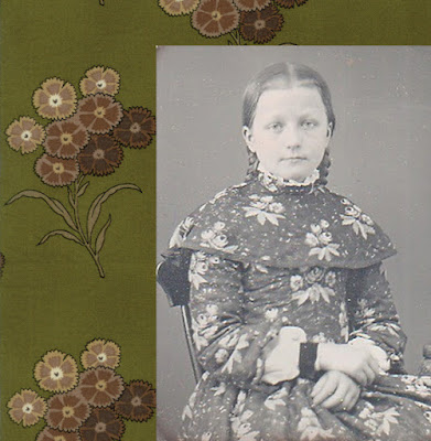
The document print (the original antique) was used as the setting squares
in a late-19th-century quilt top, now a kind of a faded pink/violet
We tightened up the repeat a little. That very airy background
with lots of space was a fashion about 1900 and I think
less background/more figure spans a wider range of taste.

We printed #8342 in five colorways.


Read the gossip about the Patterson family 200 years ago at this post:
http://quilt1812warandpiecing.blogspot.com/2012/06/10-betsy-bonaparte-bored-in-baltimore.html

Saturday, October 22, 2016

Morris Hexathon 25: Sussex Cottage


Morris Hexathon 25: Sussex Cottage by Becky Brown

I named this week's hexie Sussex Cottage for another building on Upper Mall in the west London
area of Hammersmith where the Morris family lived.

William Morris was a man of serial enthusiasms. In the last years of his life he set out on a "little typographical adventure" as he called it, developing a press to print beautiful books. Kelmscott Press,
named for the Manor he loved so much, began in 1891 in Sussex Cottage near his Hammersmith house on the Thames.
Sussex Cottage was reached through the door on the left (14 Upper Mall.)
The main building, Sussex House was home to another artisan printer, Emery Walker,
who had inspired Morris to take up hand printing.

Walker's last home at 7 Hammersmith Terrace
is open to the public, but closed in 2016 for renovation.
The Walker house is kept in Morris-firm style.
I believe it is closed this year but will re-open in 2017

The Kelmscott Press printed over fifty books during its short life from 1891 to 1898. The Story of the Glittering Plain, the first, is typical in style. Morris's old friend from Oxford days, Edward Burne-Jones, did the woodcut illustrations.

Morris made the most of his own skills at flat patterning
by designing the borders and the large initials.

Assistant Sidney Cockerell described the early days of the Press:
"The house a little old fashioned one and the single hand press at the top of a winding corner stair. ...Printed sheets, one on vellum, lying about---all most beautiful, especially the first page with its elaborately designed border."

Morris cut his own type faces,offering
three original fonts.

Kelmscott Press was Morris's last love. He died at the age of sixty-two in 1896 shortly after completing the Press masterpiece: The Kelmscott Chaucer.

Morris Hexathon 25: Sussex Cottage by Ilyse Moore

Sussex Cottage requires a hexagon and three different tumbler shapes.
Or string piece it.

The borders in BlockBase #247 can remind us of the graceful Kelmscott book borders.

The pattern was first published in 1896---one of the oldest published hexie blocks---by a magazine named the Orange Judd Farmer (Orange Judd was the publisher's name.) That agricultural newspaper called it A Cobweb Quilt. In 1930 the Kansas City Star called it Spider Web.

Pattern for an 8" Hexagon
(4" sides)
To Print:
  • Create a word file or a new empty JPG file that is 8-1/2" x 11". 
  • Click on the image above. 
  • Right click on it and save it to your file. 
  • Print that file out 8-1/2" x 11". The hexagon should measure 4" on the sides.
  • Adjust the printed page size if necessary.
  • Add seams when you cut the fabric.
Carrie Hall made a block and included it in
her 1935 book The Romance of the Patchwork Quilt in America.
She showed triangular setting pieces too.

In wools as a tied comforter

With three borders it was a popular design in the mid-20th-century,
usually as a scrap quilt


but here's a controlled color scheme (possibly inspired by Carrie Hall's.)

Four concentric borders for a central hexagon---blue triangles.

You don't need to measure---it can be a string quilt too. Just triangles,
no central hexagon.

One More Inspiration
Pattern from Quiltmaker in 2013.
Strip-piece triangles and rotate them

Mary Huey is making progress but she may have hit the wall with all the curved piecing.
One More Week. You can make it!