

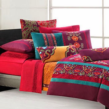
Red colorway of my Best of Morris line for Moda.
Yardage scheduled for delivery to shops in February
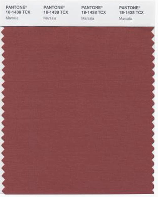
The Pantone Color Institute announces an annual color trend.
Marsala is the shade for 2015.

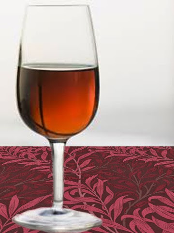
I'll drink to that.
"Much like the fortified wine that gives Marsala its name, this tasteful hue embodies the satisfying richness of a fulfilling meal while its grounding red-brown roots emanate a sophisticated, natural earthiness. This hearty, yet stylish tone is universally appealing and translates easily to fashion, beauty, industrial design, home furnishings and interiors."
It's probably no coincidence that my 2015 Morris reproduction prints in the Best of Morris collection feature a red colorway. When we plan a line a year or so before it shows up in shops we consider trending colors, which is also how Pantone picks their color of the year.
Leatrice Eiseman Executive Director of the Pantone Color Institute, explains:
"I look for ascending color trends, colors that are being used in broader ways and broader context than before.."
In each Morris reproduction fabric collection we design we include colorways that echo William Morris's use of natural dyes.
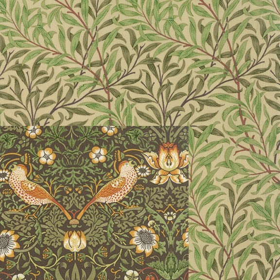
We usually include a sage green,
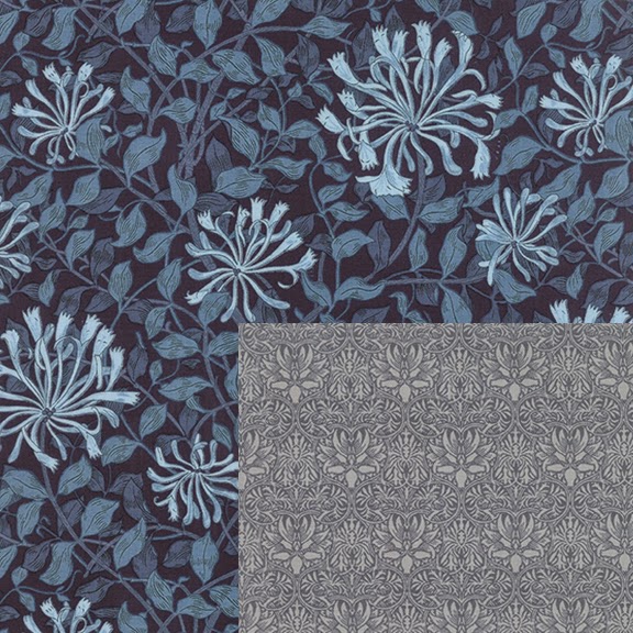
an indigo blue
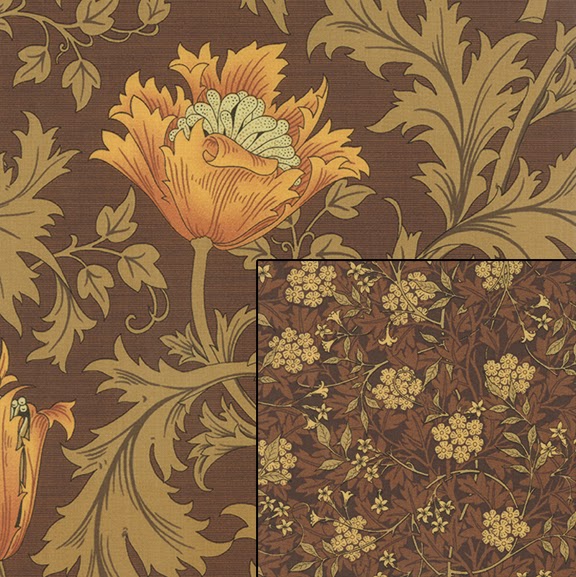
and an earthy brown
and then we choose a variable....
yellow, black, teal, lavender...
or red.
I don't do this design alone so it may be that the Moda designers who coordinate colors throughout their entire line of all their designers also saw an increase in interest in red.

Moda's Bella Solids
Tomato Soup, Kansas Red
They probably know about the Pantone Color of the Year way before the rest of us do too.

I get my ideas of what people are buying and will want to buy from decorating magazines, store windows and the bedding department at the Macy's in Kansas City.
Sometimes I'm right and sometimes I'm wrong.
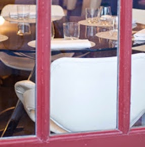
My new storm door matches this Parisian restaurant window.
I still don't know if that was a good idea.
Who are these Pantone people who set color trends? The company makes a color matching system. The "Color of the Year" is an excellent hook to hang a story about color on.

When I started designing for Moda I had a Pantone sample book and so did the designers at Moda.
I'd tell them to match #18-1436 and they'd look it up in their book.
It worked well.
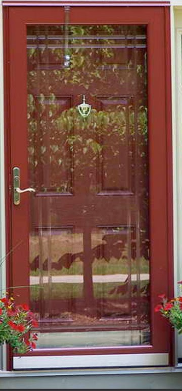
Meanwhile, I feel better about that storm door. When somebody says "Why?" I'll say: "It's the color of the year."
I do love that color, love rich and dark shades of red.
ReplyDeleteDebbie
Love it!
ReplyDeleteFinally! A color of the year that is wonderful. Past years have been really sick.
ReplyDeleteI chuckled at your last comment about the door because the whole time I was reading,my mind was saying, well, at least my exterior doors are the color of the year. Then you said the same thing! Beautiful fabric collection.
ReplyDeleteTerri-and that's why it's the color of the year. We were all compelled to choose these doors. A trend.
ReplyDeleteDo you think colors in general are going to become a more "earthy"? It seems to me it is time to move on from pink, pink and turquoise.
ReplyDeleteI am excited that you have a Marsala in the new line. I will buy some! I do dishes and the Fiesta folks are forever wishing on the Pantone's color and it never happens. I think with the dishes they have to decide well before the color of the year is announced... So I will be trendy for a few months any way.
ReplyDelete