The current term for these bright blue prints is “Lancaster blue” because the quilters who lived in Lancaster County, Pennsylvania, were so fond of the shade. The dyers, printers and designers who produced the fabrics may have called the color ultramarine, the name of the dyestuff.
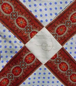
A double blue print---2 shades of blue on white
We see this blue with a touch of violet often in late 19th century quilts. The color is generally in figures on white grounds. Above is a double blue print; below a single blue.
A single blue print in a quilt dated 1875
Like double pinks, the double blues varied in color intensity depending on the proportion of dark and light color on the background.A double blue print in a quilt dated 1909
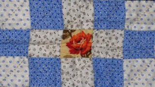
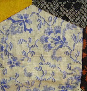
The prints can be classified as shirting prints, small figures on a white ground. They were used for dresses, baby clothes and men’s and boys’ shirts. The prints are a good clue to a post-1870 date when quilters raided the scrap bag for pieces of the periwinkle blue prints to scatter through log cabins, charm quilts and other pieced designs in the 1870s and ‘80s.
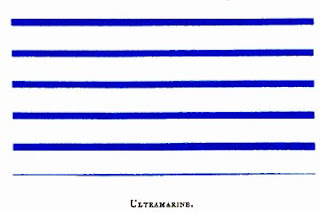
The dye may be ultramarine, a pigment also useful for printing cotton. In an 1882 dye manual William Crookes was extremely enthusiastic. "The artificial production of this magnificent pigment is one of the greatest conquests of modern chemistry."
Above a swatch of blue striped cotton from Crookes's dye manual
A hexagon in a charm quilt, pieced together from two tiny scraps
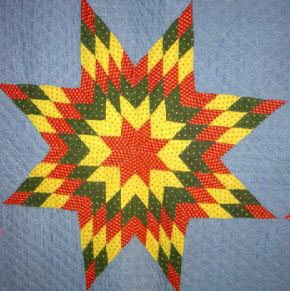
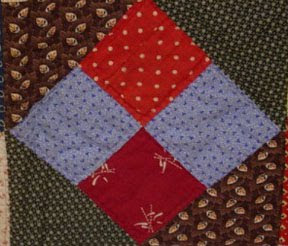
The exception to the dating rule (1870-1910) is the women of southeastern Pennsylvania (Berks, Lancaster and Montgomery counties) who maintained a regional fashion for the blue prints. They loved to set the bright blue right next to other primaries in their distinctive palette rarely seen outside the area.
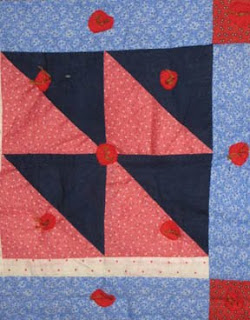
Another notable Pennsylvania style is the use of a double-blue print or a blue-violet solid as background for traditional appliqué of red, green, pink and yellow. A blue-violet background or double blue used as “the
main color field,” as quilt historian Nancy Roan described it, offers a good clue to a southeastern Pennsylvania quilt and to a date of about 1880-1930.
See a gallery of Pennsylvania quilts at RickRack.com, Sharon's Antique Quilts:
http://www.rickrack.com/gall.html
And see her blog post about a Berks County applique pattern, sometimes done on blue, by clicking here:
http://www.rickrack.com/rickrackrag/?p=31



Lovely to look at and evocative; I grew up in Spring City, Chester County-just across the Schuylkill River from Royersford in Montgomery County. I remember sleeping under a quilt my Grandma made until the heirloom wore thru in so many places it could no longer be repaired. Thank you.
ReplyDeleteI enjoy learning about prints and colors. I tend to throw things together and not think too much, but I would like to learn more about matching fabrics for larger quilts.
ReplyDeleteDebbie