QUILTS & FABRIC: PAST & PRESENT


Sunday, May 17, 2015

Union Blues and Taupes


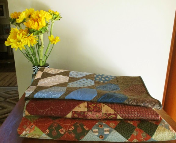
A stack of quilts by Kathe Dougherty

Kathe Dougherty is a fan of taupes and neutrals.


 I focus on the blues in my Union Blues collection. She sees it as taupes with some blue for contrast. 


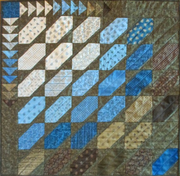
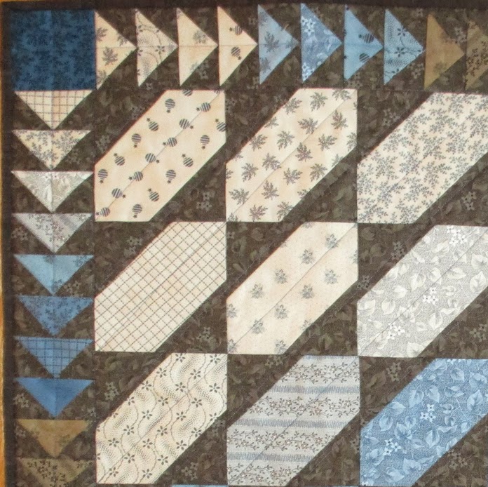
For her little quilt she emphasized the contrast between the fabrics.
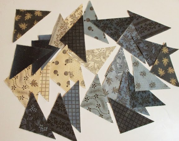
She used a charm pack of 5" squares, cut off two corners of each square and filled in with triangles of
this subtle floral...

8290-19 Concord in Bronze

Leftover triangles went into a flying geese border.


You need a charm pack and a yard of extra fabric for Kathe's design.

And we have a Mini-Charm pack, 2-1/2" squares,
if you want to work at a small scale.


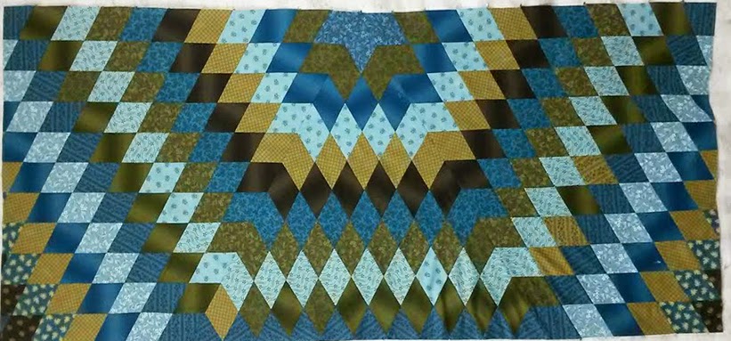
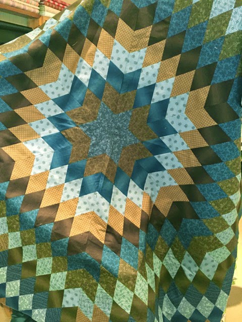
Denniele Bohannon is also emphasizing the contrast between the taupes and the blues. She's working on a sunburst.

She cut a 60-degree diamond template and designed as she stitched. Chopping the edge into a rectangle is always painful but the results are great. Kelly is quilting the top right now so hope to have a finished photo to show you soon.


Thursday, May 14, 2015

My Virtual Booth at Minneapolis Quilt Market

This looks pretty fancy, huh! 

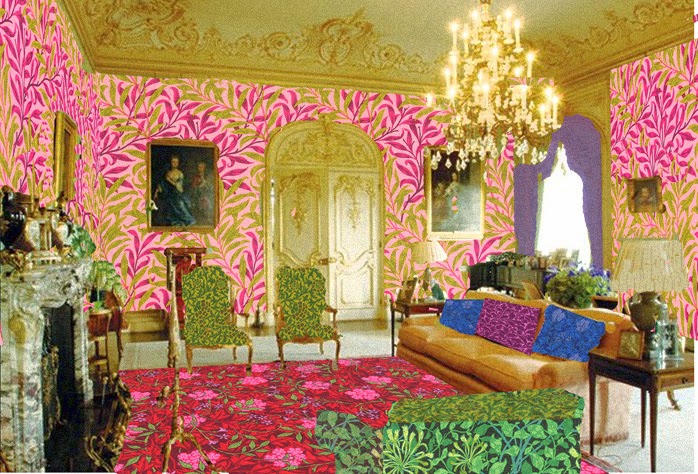
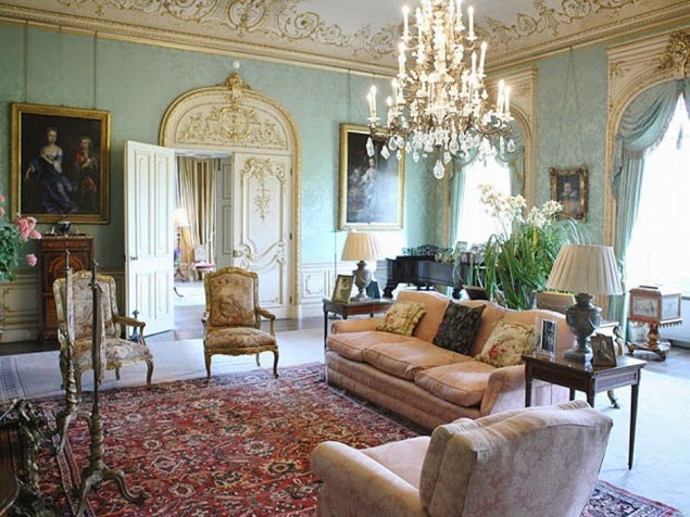
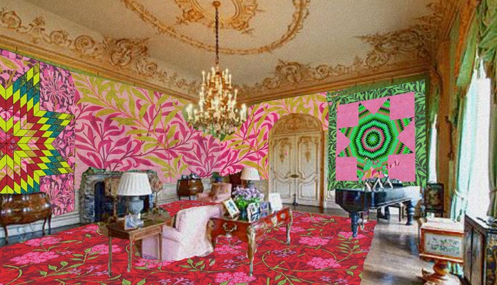
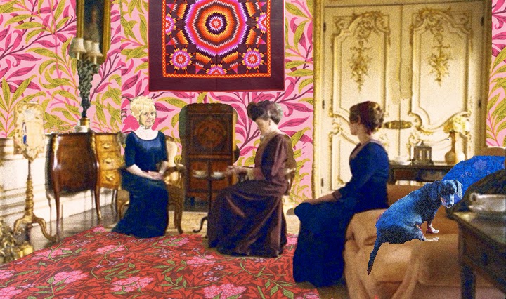
For my virtual booth at Quilt Market this week I envisioned an exact replica of the drawing room set for Downton Abbey, but redecorated with my new Morris Jewels line. 


The set at Highclere Castle in reality

That old green damask wallpaper was a little old-fashioned in my opinion so I did the walls in my favorite version of  William Morris's Willow Boughs from Morris Jewels.

#8113.27

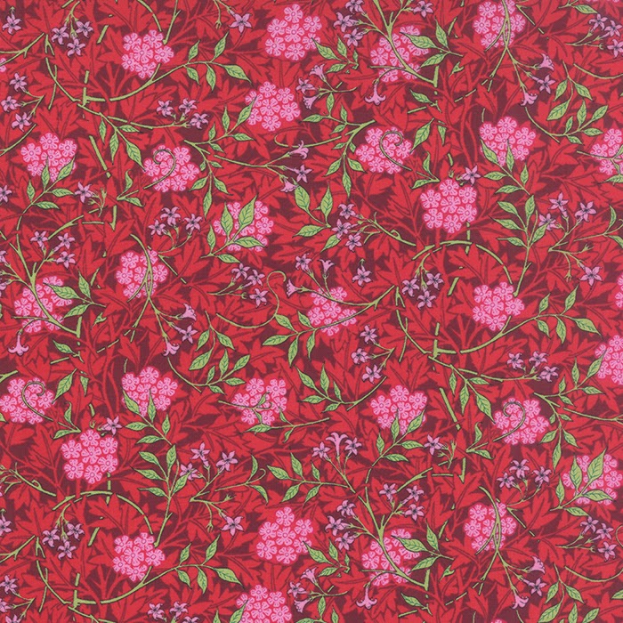
I made a floor cloth of Jasmine

Jasmine  #8141-33

I added a few quilts done up in The Morris Jewels fabrics and took out most of the family portraits. Who are those people anyway?

I thought it would make a cozy little booth. Do come in and we'll give you decorating advice.


After looking at this photo I think there might be too much going on in there. If we aren't too busy we may paint the woodwork and ceiling white on Thursday night. All that picked-out gold is a bit over-the-top.

Remember! I am making this up!

But there really is a Morris Jewels fabric line. Precuts will be available next month. Yardage in July.


Here's a link to Moda's information on the fabric:


And remember that Moda really does feats of carpentry and decorating at market. See Carrie's blog post about getting ready for market here:


Monday, May 11, 2015

Baltimore Album Quilts 3x3


I'm looking for a unified field theory for applique. How this miserable task started was I have a new/old applique quilt with three different blocks. It looks Baltimore-ish to me. The blocks aren't layered flowers, triple bowknots, white roses or the wreath above: simpler designs. (More later about that quilt.)

So I thought I'd try to find the three patterns in Baltimore Album quilts.

Not actually my files. Mine aren't this neat.

My files (both paper and digital) are a mess.

Joyce Gross and Cuesta Benberry comparing notes.

If only Cuesta and Joyce were around. Many years ago when computers first became practical we did a numbering system for every Baltimore album (BAQ) in our files. I never talked the dynamic duo into computerizing their files but they had some mighty nice notebooks full of every BAQ we ever saw---hundreds in numerical order and we could find them in a minute. (I'd guess their notebooks are with their papers: Joyce's at the Briscoe Center in Texas, Cuesta's at the Museum of American Folk Art in New York---UPDATE: Merikay reminds me they are at MSU's Museum in East Lansing Michigan.)

I thought maybe I could apply our numbering system to my pictorial files. As I recall, we started with the number of  blocks in the set. 3 times 3 = 3x3. We also added border info since there are fewer border possibilities than block possibilities. We could instantly say it was a 3x3 with an appliqued border and see if we already had a picture.

Therefore the quilt below would be a 3x3. I arbitrarily made it 3x3-1.


3x3-2 is an old black and white picture from 1983

 I found I had seven examples based on a 3x3 set. Some of these quilts are small but most are large: 84" across.


This last one is a recent addition. It's in the DAR Museum's
Eye on Elegance exhibit. See this link:


Once I had the BAQ's numbered I was sure I could find the applique patterns I was looking for. I can now coordinate the numbers in my Encyclopedia of Applique for many of the simple designs.

BAQ #3x3-1-A3
Encyclopedia # 05.55 variation

And I feel a lot better now. This block in the quilt at the top of
the page has both a BAQ number and an Encyclopedia of Applique Number.


There are two variations in my pattern index.


#5.54 is from an unnamed album quilt dated 1844.


#5.55 is from a quilt in the Shelburne Museum. They gave the 19th-century quilt a 20th-century name: Laurel Leaves. 
Stella Rubin has a great example for sale. She calls it
Laurel Leaves, which is the standard name today.


Here are two variations from vintage quilts.
This one from a quilt dated 1849 by Mary Jane Shoemaker
from Rockingham County, Virginia.


I'd never noticed how consistently the top 3 leaves are colored.
The quilt artists probably didn't think of them as Laurel Leaves but some kind of flower
with paired leaves. 


Block 3x3-1-A3 has a gap in the middle but I'd still call it
a variation of  5.55. Maybe I'll number it 5.56

Well---that block isn't in my new quilt but I love having things in such nice order. And having better pictures than my black and white tracings in the Encyclopedia.

A variation with heart-shaped flowers from Mary Ann Gray's quilt.

I'll keep looking for my blocks and I'll show you my BAQ files in neat order for the next few months. Next time the 3x4's.
The biggest problem will be when I get to indexing the 5x5 section. There are dozens and dozens of BAQs set like that.


And I'll also show you a simple pattern that you could update---adding a patterned background like this mock-up of a blue and white print from my Union Blues line.

And feel free to print out my digital  BAQ index pages if you like to keep your inspiration in order.


Friday, May 8, 2015

Haint Blue


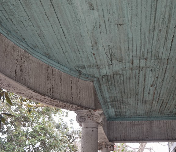
A few weeks ago I learned a new color name from the
discussion among my Stars in a Time Warp starmakers.

Mule Hill said Indigo and Haint were her favorite blues.

Terry asked: Is that Haint a pale sky blue? Like the colors under porch roofs in Key West?

MH: I prefer the Carolina medium haint but yes, porch roofs, doors and window trim. Keeps evil out. I sew with it a lot. Happy Color.

T: I agree! And I actually made my husband paint the ceiling of the porch on the front of our house that blue---it keeps the mud daubers from making nests!!

Haint, I assume, is a Southern word for a haunt or a ghost.


Well, now I know what haint blue is. In Kansas we call it "You know the color on the front porch ceiling." Haint blue might be easier to say.

I'm not from Kansas but when I went to college here fifty years ago I had good guides to the popular culture. They were mostly from Southern Kansas but their knowledge of the proper colors to paint a house held true in the abolitionist town of Lawrence.

The siding was white. The window screens and screen doors
had two options, shiny black or screen door green, a hunter green.
The green was dark with a little bit of blue in it.


We also called it John Deere green.


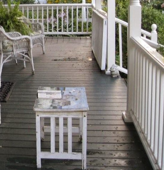
The porch floors were gray

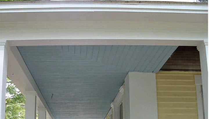
And the porch ceiling was "porch-ceiling blue."

When I asked why everybody painted the porch ceilings blue ( a color usually not repeated anywhere else in the building's color scheme) I was told it keeps the flies off the ceiling. Probably because they think it's the sky and they won't land there.

I liked the color, the tradition and the promise of no flies. I painted the porch ceilings blue.

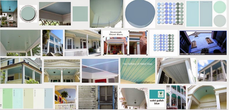
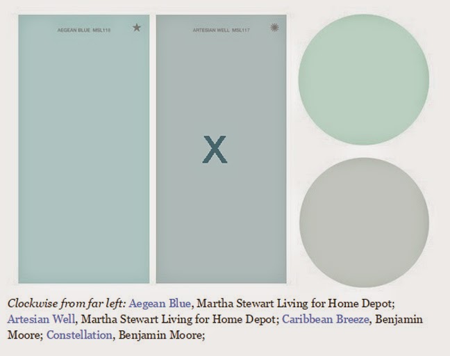
If you look around the internet for exactly what color "haint blue" is you will find a wide variety of opinions...

from turquoise to blue gray.


In Kansas it's a true blue---maybe like the swatch with the x in this snapshot from the Huffington Post. But it's clearer, not so gray.

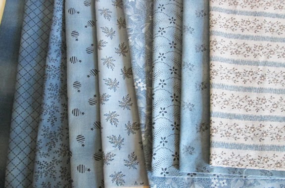
Alice's Scrapbag
I've been using it a lot lately and like Mule Hill says,
it goes well with indigo

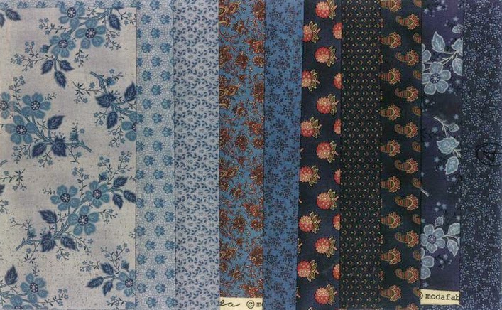
Union Blues

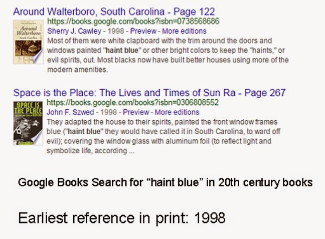
I also did a Google Book Search for "haint blue"and the earliest I could find the term in print was 1998. So it's a Southern folk term that only recently has been written down.

Now everybody is using it.

And you've got to admit it's a better description than "under the porch ceiling blue."

Does it confuse mud daubers and flies? Read this:

http://www.gardensalive.com/product/ybyg-507-does-the-color-blue-repel-pest-insects/