QUILTS & FABRIC: PAST & PRESENT


Saturday, March 9, 2013

Spacer Borders


Many of us would describe this Irish Chain quilt as well proportioned. Viewed as a piece of art on the wall, the double border and the bright-colored binding frame the inner composition nicely. The quilt is probably from about 1880 to 1910 or 1920.

Similar aesthetic

For both these quilts I am guessing origins in a German Sectarian Community, possibly Pennsylvania, but perhaps Ohio, due to several design characteristics noted by quilt scholar Ricky Clark in a chapter in the book Quilts in Community: Ohio's Traditions. A vivid palette, multiple borders and contrasting binding were favored by women of German ancestry and Anabaptist Protestant faith, women described as German Sectarians. The best-known among these conservative Protestant communities are the Amish and Mennonites.

Amish quilt from the early 20th century.
Women in Amish communities in places like Iowa and Kansas
also used this aesthetic.

Once late-20th-century quilters began seeing these classic Amish and Mennonite quilts in print and in museums we began to think of their double borders as a design necessity.

Amish quilt date-inscribed 1928

Mennonite quilt

Today we tend to call the inner border a spacer border, especially if it is narrower than the outer border. It's a fairly recent term. I found that Marsha McCloskey advised using "a spacer strip...a plain inner border" in her 1984 book Projects for Blocks and Borders, indicating that the term came into use in the mid-1980s.

She was probably talking about using a plain border to separate two pieced borders, so a spacer strip could be any width of plain border as in her wide white border here.

Amish Quilt
Today we think of a spacer as creating a color space too.


The German Sectarians weren't the only quilters in the past to use double borders. This Drunkard's Path (notice it is two alternate blocks) was probably not made by a woman from a German Brethren group.
Other women liked pink and other women used a double border.

Or a triple border.


And that inner framing border wasn't invented in 1880.
The quilts above and below may be from 1840-1890.


It may be that we see more of these multiple strip borders after 1870 when the sewing machine made long seams more practical.


Whether your machine was treadle or electric powered.


 That Germanic aesthetic of the 1880-1930 era works so well.
It's one more thing that makes these quilts so collectible.


Here we have a double inner border with contrasting binding.
Four frames around the baskets.

Six frames!


And then there is the pieced inner border.


You can see why the spacer border is so popular today.
The proportions seem just right.


Wednesday, March 6, 2013

Framing Morris Flowers

Memory Wreath by Becky Brown
(The large print is Honeysuckle from A Morris Garden.)

I am thinking fussy cutting...


Becky Brown
detail of True Blue
(The large print is Eden from Morris Apprentice)

Inspired by Becky's blocks for my block-of-the-week for the Grandmother's Choice sampler...

Jack's Delight
By Connie B
 And  by other stitchers who are making the blocks every week...

(The large print is Anemone from Morris and Company)

Memory Wreath
Like QuiltingBearGal
who framed another flower from Anemone...


Simple Graces by Bobbi Finley

And by Bobbi 
who did some Broderie Perse with the Anemone print for her version of a quilt from Kim Diehl's book Simple Graces.


Detail of Bobbi's center

Oakleaf and Cherries
With all that inspiration I am fussy cutting 
some of the gray/green Morris prints for applique.
(The large print is Strawberry Thief  from A Morris Tapestry)

Roseanne Smith did the cutting for this block. I appliqued it.
The patchwork pattern is Oakleaf and Cherries from
the Carrie Hall's Sampler book I did a few years ago.

(The large print is Daffodil from Morris and Company)


I wanted something simple that would show off the prints.

I was just going to do one Oakleaf and Cherries block but now I have three.

The blocks finish to about 20" so the quilt could get large.
Pimpernel from The Morris Workshop is on the cutting table now.


Callie Lavoie sent a photo of her Carrie Hall Sampler. She and friends each did a version. She substituted one Carrie Hall block from Bettina Havig's book Carrie Hall Blocks. I was going to make all the blocks but I got fixated on one.

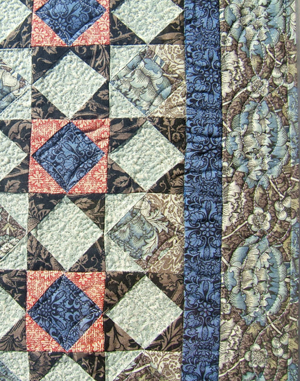
See more quilts made from William Morris fabric at my Pinterest Page QUILT WILLIAM MORRIS:


I just added this one, a framed mini from PiecefulThings that you can buy at their Etsy shop

The big print in the border is Wandle from Morris & Company


Sunday, March 3, 2013

Black Prints: Neons or Novelties


Black prints seems to be the topic here lately. Blacks with a true black background are among the easiest prints to date, so a good knowledge of black ground prints is useful to the Quilt Detective. See some posts on black and gray here:

Black cotton prints are a good clue to a date "After 1890." Many different print styles developed once black for cotton was available to dyers, printers and customers. 

My favorite is something that quilt historians have been calling neon prints for the past twenty years or so. In my book on fabrics Making History I devoted a couple of pages to Black Novelty or Neon prints.


My first experience with them was the Morning Star top above, which is full of these black prints with bright colored figures. When I bought the top I was surprised to see so many of these dramatic prints.

Morning Star by Bobbi Finley
Bobbi interpreted my antique top in reproduction prints.

Swatch book with black cottons from about 1900.

I found quite a few black prints with colorful figures in mill books from the early 20th century at the American Textile History Museum in Lowell. The earliest examples I found there were produced by the Merrimack Manufacturing Company in 1896, three years after sulfur black dye was discovered.


Realizing how colorful some of the dark prints actually were changes one's perspective on the black and white photos of fashionable women from the early 20th century.

Above are some antique prints pictured in 
Making History: Quilts & Fabric From 1890-1970

And here are details from online auctions.
The backgrounds are a true black and the figures are quite vivid. You can see why we call them neon prints today. At the time the catalogs called them "Black Novelty Goods" or "Fancy Black Novelties."


They were an interesting combination of novelty and nostalgia.
The colors were brand-new 1900, but the print styles echo some of the quirky designs from the 1820-1850 period such as:
  • Serpentine Stripes
  • Eccentric geometrics
  • Corals and seaweeds
  • Rainbow or fondu prints


Like other black ground prints, the black novelty prints are a good clue to a date after 1890---and I'd be more conservative and say after 1900. They fell out of fashion about 1920.


You sometimes have to look for them to notice the Black Novelty prints.
This top at a distance looks rather subdued but closeups reveal how fashionable the maker was.
Note the squares of neon prints in the inner side borders.


The black backgrounds rarely rot, fade or bleed but the bright dyes in the colored figures can be quite fugitive, especially when washed. We often see these prints at their best in unwashed tops and blocks. When washed, the color can fade and sometimes there is just a trace of color left.


Reproduction prints pictured in Making History.

YEARS ago Terry Thompson and I did a line for Moda called Ragtime that echoes these neon prints.
I am always pleased to find some still available in online shops. Do a websearch for the words Ragtime Moda and see what comes up.

Reproduction


Original
A lace print jumps out among the mourning grays.


Two colorways of the same antique print.


Read more about neon prints here:
http://barbarabrackman.blogspot.com/2010/05/ragtime.html