QUILTS & FABRIC: PAST & PRESENT


Showing posts with label Lately Arrived From London. Show all posts

Friday, January 6, 2012

Warp Prints-Real & Fake

The print I called "The Schooner Minerva" in my Lately Arrived from London reproduction collection can be classified as an imitation warp-printed print. If this terminology is a mystery to you read on...
We have to start with the basics.
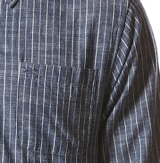
Fabric woven on a loom has a warp and a weft. The warp yarns are the long yarns that attach to the loom. Above: the vertical warp yarns are dark, the horizontal weft yarns are light. 
With that dark and light yarn setup the pattern would be similar to the above, something we might call a chambray.


Weavers obtain pattern by varying the colors in warp and weft, giving us woven stripes and plaids.

A warp-dyed pattern is obtained by using a variegated warp yarn. Above the warp yarns blend from dark to light. Many cultures maintain a tradition of warp-dyed pattern. We use the word ikat (ee'-kaht) to describe this style, a Malaysian word. Another, kasuri in Japanese (kuh-sur'-ee).


 Here's a blog post from a weaver on the topic
http://einesaite.blogspot.com/2011/11/beginning-ikat.html

If the weaver uses variegated yarns in both warp and weft the pattern possibilities increase. This warp and weft dyed pattern can be called a double ikat. Knowing how the warp and weft yarns should be colored is a real skill.  
Yarn-dyed weaving patterns have a characteristic fuzzy edge. Above a geometric with the typical indefinite outline.
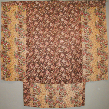
An Asian robe
The pattern possibilities vary with the collaborative skills of the weaver and the yarn dyer.

French weavers developed different looks
with expensive silks for luxury goods.
Here an antique overall floral, apparently warp dyed.

Florence Pettit in her 1970 book America's Printed and Painted Fabrics used the French word chiné (sheen-ay???) or flammé  (flahm-ay) for these French silks with woven pattern.

Late-18th-century Europeans inventing technology appreciated the traditional look but not the traditional skill so found faster, cheaper ways to get the effect


by printing imitations with blocks and rollers.
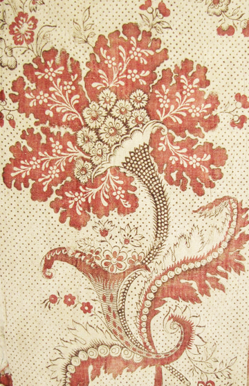
Above a late-19th century floral.  

These European fabrics have the characteristic diffused edges which makes them look out-of-focus from a distance. Many of these complex prints are both warp-dyed and weft-dyed. Sometimes the imitations are so good one has to flip the fabric over to see if it is printed or woven. If it's woven it will have the pattern on the reverse.
But if it's printed, like this reproduction, the back shows no evidence of variegated yarns. This could be called a warp-printed fabric, or an imitation ikat, I guess.

The document print from the early 19th century for this reproduction also has a fancy machine ground (sort of fingerprint whorls) a look not obtainable with weaving. Like many early roller prints, it's a layered extravaganza of new technology.


The fact that the style is imitation ikat or imitation warp dyed pattern really doesn't offer any clue to date. It's just interesting to think about the complexities of pattern on cloth.

Friday, November 18, 2011

Fancy Machine Grounds

Every early 19th-century reproduction line needs a print with a fancy machine ground.
For my Lately Arrived From London collection for Moda I had a rather large piece of fabric with a floral trail figure atop a detailed "fancy machine ground." The document print above is the larger piece, the reproduction is the smaller square. It may date to about 1820-1840.


In the englargement you can see the finely detailed dots behind the florals. They not only add a background, they form part of the floral figures. These backgrounds were not engraved on the roller by hand; they were applied in a machining process.


Above:  the tan reproduction in the top left and the larger brown document print for the Meryfield print from my Hartfield collection, an early-19th-century line I did a few years ago. The green leaves in the original were probably done with a wood block, the brown ground printed with a roller. Notice the streak in the fancy machine ground, indicating it crimped in the roller.


Once printers figured out how to apply detailed machining to copper rollers the designers came up with many outrageous combinations as in the print from an old quilt above. The insect-like figure and the striped machined ground have very little in common. And then there are those green sticks.... People loved the variety and the layers of detail.


Designers and customers welcomed the new look about 1810 because older wood-block printing limited the types of backgrounds. One typical wood block ground was a solid color hand applied around the figures with a wood block, as in the chintz above. The technology wasn't perfect and printers often left haloes of white between the figure and ground---the registration was off.

For more detail the block printer could add a patterned ground behind the figure, in this case a regularly spaced dot, probably applied with a wood block fitted with pins in a regular pattern. In England these dotted grounds were called Stormont grounds, in France picotage.

But the fancy machine grounds were ---well much fancier---than the old Stormont grounds. Once the roller printed grounds were possible the designers and the printers showed their skills in many combinations of figure and ground. The detail is impressive, the registration is perfect---the only flaw (if one were being picky) is that the design combinations were sometimes strange.

So if you are looking for an authentic 1810-1840 look buy prints with detailed grounds---fancy machine grounds. You wouldn't see them any earlier than 1800 because the technology wasn't there yet. And they fell out of favor about 1840 as new styles developed.
Above is the Little Molly print in the muslin colorway that shows the fancy machine ground off the best.

In the tea colorway the shading dominates the florals, creating a rainbow look.

In the plum colorway the ground is more subtle and the figure stands out.

Tuesday, September 20, 2011

Pillar Prints

A mockup of the pillar print in my Lately Arrived From London repro collection. 


Every early 19th-century reproduction collection needs a pillar print.

Pillar prints were popular in the early 19th century when new dye ideas
 enabled printers to put bright color next to bright color.

The designs echo the classical architecture of ancient Greece and Rome with stripes assuming the form of fluted columns interrupted by ornate capitals and garlands of flowers.


A tea-ground chintz print from about 1815.
 The reds here were probably printed by copper cylinder,
 the blue, yellow and overprinted green added by blocks or hand.

Other names for the style are “architectural prints” or "columnar prints."

Monochrome patriotic print.
One indication of a roller or cylinder printed fabric is the short repeat.
 Roller-printed design repeat about every 15 inches.
If this were printed with a larger copper plate
the repeat would be over twice as wide.

The term "pillar print" seems to be rather recent, a mid-twentieth-century name. The earliest reference I have found by searching Google's digitized books is in a 1956 British publication. The term is more commonly used to describe Japanese wood blocks on paper, in which a pillar print (hashira-ye) is a long, narrow print meant to hang from a wooden pillar in a house.

Detail of a whole cloth quilt.
Stripes inside a stripe.
Pillar prints were popular for decorating before 1830 or so.

Florence Montgomery noted an English printer's mention of a chintz with pillars and garlands in a 1760-62 notebook, which may be the earliest reference to the design idea in a print, but surviving examples printed with woodblocks date only to the end of the 18th century. The pillar prints we come across in American quilts tend to be from about 1800-1830 and usually printed by a roller.

Stripes pieced into strips. Two different prints in a strip quilt.

The same pillar print as above but a different colorway.

And another colorway.


 English museum curator Peter Floud wrote a series of articles for The Magazine Antiques on "English Printed Textiles" in 1957. He examined four English printers' pattern books in the collection of London's  Victoria and Albert Museum and the Musee de l'Impression of the Societe Industrielle at Mulhouse, France. Floud's conclusions remain the standard scholarship fifty years later.

"The pattern books show that [pillar prints] enjoyed two quite separate spells of popularity; the first between 1800 and 1808, when a very large number of polychrome block-printed pillar prints were turned out by all the leading English printers; the second between 1825 and 1830, when it was revived as a vehicle for some of the finest roller-printed designs ever produced. It appears in both cases to have remained a purely English phenomenon, without any parallel among French printed fabrics."

Architectural prints were popular with American quilters
 between those two periods of production.

At top of this photo the document print for the pillar print
 in the Lately Arrived from London reproduction collection.
At bottom a tea-ground and a white-ground colorway.

A utilitarian four-patch with a
 pillar print in the border along the top.

For the quilt detective looking to date a quilt rather than a piece of fabric the best estimate might be range of 1800-1860. The fabric may have been unfashionable for interior decoration in the 1840s but quilters continued to salvage patches from their old drapes for decades.


One does not often come across pillar prints in borders and strips,
 but look for them as scraps.

Quilt from the Spencer Museum of Art, about 1830.


Several years ago Terry Thompson and I
reproduced this print for a Moda reproduction collection.
Above is the document.

Here's the reproduction with a chocolate ground.
Buy 5 or 6 yards when you find these pillar prints as they make terrific borders for quilts copying an early 19th-century look. [I always tell you to buy 5 yards, but better to be safe than sorry.]
Kathy Ronsheimer didn't buy ENUFF,
so she had to cut the pillar in two for a border for her
 version of Jeana Kimball's Old Voices New Impressions sampler
But it all worked out nicely, don't you think?

Click on the link to see Florence McConnell's reproduction quilt using a pillar print
http://www.americanquiltstudygroup.org/qs_star_study05.asp 

Monday, September 12, 2011

Strike-Offs and AQSG Donation

Some of the strike-offs from Lately Arrived From London


Strike-offs are like proofs. Once the printers have cut the screen they try different combinations of the colors selected for the collection. The designers then choose the ones they think work best. Some work well and some don't.


Some like this blue chintz work GREAT, but they don't really go with anything else in the line.
Editing these out is like editing one's prose. Ouch! That was a great print---but the only blue-and-white-toile looking piece in there. We'll do something similar again some time.

When we are doing a reproduction line we also have to edit for accuracy. That pink pillar print at top left above is interesting, but it just doesn't look like the kind of pinks you'd have in 1810---so it gets the heave-ho.

And the olive greens on the left. The greens work fine as an accent color but not as a background. Just not done in 1810. Goodbye, greens.


We started with about 70 variations on 8 prints and by process of elimination we wound up with 28 skus (a sku is jargon for a colorway of a print).

Only 28!---well I forgot to mention that economics is also a motivation. We'd decided this would be a small line. Some of my repro lines go up to 42 skus. Why small? Early 19th-century reproduction prints are a niche market. You readers are probably part of that niche---it's a sophisticated niche.
Another reason: If we'd do 50 skus shop owners would say they couldn't afford to buy the whole line. And they'd be right.

So that's the explanation as to why there are no blues, pinks or olive greens in the Lately Arrived from London collection. Design, accuracy and economics.
But what about all those small pieces that were eliminated? Unused strike-offs usually go into the recycle bin but I weasled these out of the boss. For a good cause.


I asked my friends to make 16 patches and asked Bobbi Finley to set them with the larger chintz scale strikeoffs for a quilt top pieced of fabric that was only printed once. We filled in with yardage that was printed---and some from other sources.


So here is a top made of fabric that nobody else in the whole world has.

We added a border of the pillar print from the yardage.
And we are donating the top and a bag of scraps left from the strike-offs to the American Quilt Study Group's Auction that will be held at their annual seminar September 21-26 in Cherry Hill, New Jersey. AQSG benefits and you can go home with a top made of truly one of a kind prints or a small stash to make your own.

See more information about the American Quilt Study Group seminar here:

The benefit auctions, silent and otherwise, are always terrific.