

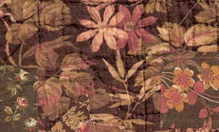
Document print for "Ohio Autumn", a cretonne from Arnold's attic

"Ohio Autumn" recolored for Arnold's Attic
Cretonne, a word once common in the American female vocabulary, is now obscure. I first heard it in the 1970s when I was teaching quilting in Chicago. I suggested the students buy some large-scale prints to contrast with their calicoes. An older woman glared at me: "I'm not putting any cretonne in my quilts."
Bronze-shaded swatches on top of a cretonne quilt back.
She pronounced it CREE-tawn with the emphasis on the first syllable and explained that cretonne was a cheap print, prone to fading and too coarse a weave for patchwork. She was talking about the furnishing fabric she grew up with, inexpensive large-scale prints that were used to cover footstools, drape the kitchen sink and tie into whole-cloth coverlets.

Photo by Lewis Hine, about 1910, of a family making paper flowers.
Collection of the Library of Congress.
The cretonne-draped clock shelf on the right was a common feature of interior decorating. Hines, documenting child labor, viewed these New York City apartments as dreary but the women's use of fabric for inexpensive decorating was often very up-to-date.

Irish Chain with a large-scale print as a border, 1870-1910?.
This quilt is a little odd in its mixed styles and hard to date from the little photo in an online auction. The ordered patchwork design pieced of bright calicoes with no neutral was popular at the end of the 19th century, particuarly in southeastern Pennsylvania. But the use of the large-scale cretonne for a border is quite old-fashioned.

Is that blue fabric a European chintz or
a later domestic cretonne imitating an earlier color scheme?
Larger-scale fabrics remained widely available. Cretonnes were the "proper thing for draperies, hangings, furniture covering, etc." according to the Sears catalog. The name cretonne (pronounced cruh-TAWN in imitation of the French word) is derived from Creton, a French town that had specialized in manufacturing a coarse cloth made from hemp.

Tintype of a boy on a cretonne throw
about 1870
In 1889 Chambers Encyclopedia defined cretonne as
"originally a white cloth of French manufacture…now applied to a printed cotton fabric used for curtains or for covering furniture, which was introduced about 1860. Chintz, so much employed for the same purpose in former years, is a comparatively thin printed cloth usually highly glazed. Cretonne, on the other hand, is generally thick and strong for a cotton fabric, and with a twilled, crape, basket, wave, or other figure produced on the loom. When a pattern is printed on this uneven surface (it is sometimes plain), it has a rich, soft appearance. A cretonne is rarely calendered or glazed. The thick weft threads of inferior qualities are commonly formed of waste cotton, and the patterns upon these, though often bright and showy, are as a rule printed in more or less fugitive colours."

Cabinet card of a girl and a cretonne wholecloth coverlet
about 1890
In a 1918 definition, chintz was described as the English word and cretonne as the French word for drapery prints. The reality may be that cretonne as a name for inexpensive cotton furnishing prints is a Frenchification that elevated mundane goods to a more sophisticated level, much in the way that those of us who buy our wardrobes at Target or J. C. Penney pronounce the stores' names with a French accent when asked where we shop.
The arc of taste swings between clutter and simplicity. As modernism dictated austerity one magazine advised in 1919:
"Cretonne curtains are used by interior decorators in rooms where odd chairs are covered with various patterns of cretonne, but this treatment requires a most experienced eye. A motley color scheme is best avoided by the average home decorator. Even when beautifully harmonized by an expert, the use of a number of colors and patterns becomes tiresome in a short time as plain effects never do."

Plenty of cretonne creates a "motley color scheme" in an 1897 stereo card studio.
For more about cretonne see my book Making History: Quilts and Fabric 1890-1970.
http://www.ctpub.com/productdetails.cfm?PC=1212
Growing up in England in the 50s cretonne certainly had a 'not chic' or 'stuffy' connotation.
ReplyDeleteThanks for a most informative post. I had never heard of this word before.
ReplyDeleteAnother fascinating post. I, too, had never heard this word, now I will pay attention and be able to recognize it in old quilts. Thanks, for the education, and I LOVE the old photos!
ReplyDeleteIt does sound better when frenchicated as
ReplyDeletecray-toe-nay.
Sandra
Thanks for the information! I read this word all the time in Grace Livingston Hill's books, and wondered exactly what kind of fabric it was. This seems to be mostly what she is referring to
ReplyDeleteThanks for the information! I read this word all the time in Grace Livingston Hill's books, and wondered exactly what kind of fabric it was. This seems to be mostly what she is referring to
ReplyDelete