Monday, August 30, 2010

The Quilt in the Picture

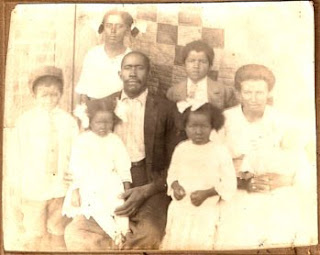
Photograph purchased in Texas, probably from about 1910

Georgia artist and historian Vista Ann Mahan is the expert on quilts in old photos. For years she has been collecting pictures of people with quilts as backdrops. She also has collected information about the photograph style, finding it to be a Southern regionalism.


Vista in a portait for Ladies Circle Patchwork Quilts about 1991

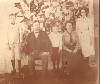
Those of us who collect old photos come across these occasionally in antique shops. With the advent of online auctions we have more access to them, but the competition for the photos tends to be tough. Somebody always bids $1 more than I am willing to pay.


A recent online auction piece

In her paper on the topic for the American Quilt Study Group in 1991 Vista found that of the 59 photos she could date at the time, the most common time frame was between 1891-1920. One portrait of her family with a quilt backdrop dates to 1860.


Vista believes that these photos were done by itinerant professionals. Rural people remembered photographers who came "to a community once or twice a year, stopping by all the farms inquring if families wanted their picture made."

The examples she found were primarily from the Southeastern U.S. although she had one Canadian example.

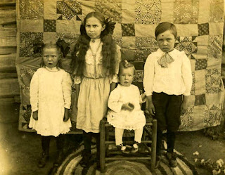
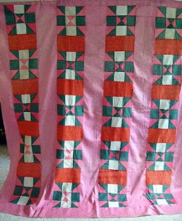
We can imagine that the quilt in the picture provided both physical background and symbolic status. In this case, the use of a T-patterned quilt MAY have symbolized the girl's enthusiasm for Temperance ideals.


Vista's paper "Quilts Used as Backdrops in Old Photographs" was published in the research papers of the American Quilt Study Group: Uncoverings 1991. See ordering information by clicking here:
http://www.americanquiltstudygroup.org/uncoveringsList.asp

If all this sounds interesting to you you will want to attend this year's American Quilt Study Group Seminar in Minnesota on October 14-17, 2010.
Click here for more information:
http://www.americanquiltstudygroup.org/seminar.asp
It's the place for quilt history.

See family photos by clicking on these links.
http://mcguffin.com/100yrs.html
http://www.floridamemory.com/PhotographicCollection/displayphoto.cfm?IMGTITLE=RC17818
Photographers often used coverlet and tablecloths for backdrops too.
http://blog.familytreemagazine.com/photodetectiveblog/2007/04/26/BlanketBackdrop.aspx

Thursday, August 26, 2010

Hoo Doo, Humility and Deliberate Mistakes

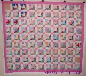
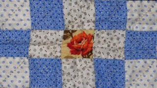
I've been saving pictures from online quilt sales in which the dealer advertises a HOO-DOO block or a HUMILITY BLOCK in the patterning. The quilt top above has an error in the top left hand block. A triangle is switched.


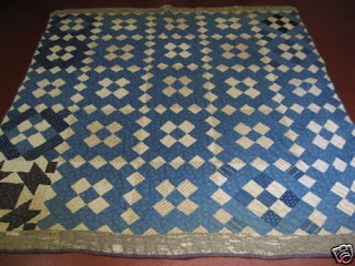
Here's one advertised as having hoo-doo block. I believe she is referring to a break in the patterning. Notice the blank peach-colored blocks at top left and in the second space up on the bottom right.


In this quilt from about 1900 the break in the patterning is a completely different design in the lower left hand corner.

I bring this up because I have carpenters working on my porch. One installed two of the three hinges on the screen door going one way and the third upside down. I pointed out this error to another carpenter. He shrugged and said, "It's a deliberate error for good luck."

Translation: "I don't want to fix it."

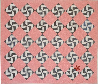
It's hard to see the error in this quilt from about 1900 so I put a red star on it in the lower row.

The phrase humility block alludes to the idea that in some religions it is considered too proud to attempt perfection, therefore one makes a deliberate error to prove to the deity that one is not perfect. (Exactly what religions is vague.)

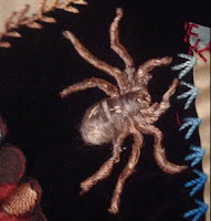
But we can trace the idea all the way back to Arachne, an uppity human in Greco-Roman mythology, who was too proud of her weaving skills. She challenged the Goddess of Craft to a weaving duel, a bad choice on her part. Her weaving was perfection and the jealous Goddess turned her into a spider.

Those of us who make quilts know errors are all too easy to make. 

 
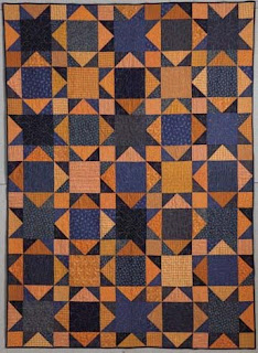
Jean made this quilt for a pattern sample. None of us noticed the error (not the pattern drafter, the seamstress, the quilter or the editor) until we had it on the wall for photography.
The error is in the lower right area along the edge. She flipped a strip of triangles.

The errors tend to be accidental. The stories about hoo-doo and humility blocks tend to be hype designed to sell quilts.

Log Cabin, about 1900.

Remember that symmetry was not so important to people making quilts to use on a bed.
Don't fall into the trap of using your standards for perfection to interpret quilts from the past.

Tuesday, August 24, 2010

Brackman Numbers

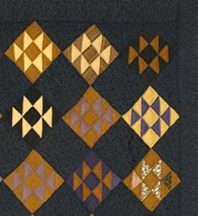
Detail of a quilt from the New England Quilt Museum.
See the worksheet on this quilt and a full photo by clicking here:

I enjoy browsing through the Quilt Index online database. I go to the main page (http://www.quiltindex.org/)
and put the name of a pattern in the quick search box at the top. I picked the name Old Maid  to see what would come up.

Lots. Among them the above quilt. I often go to the Full Record page and read something about the quilt.

If you do this you will see this category as you scroll down.
BrackmanF011a

1689a

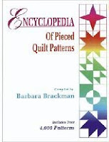
That is the Brackman number for the pattern. It refers to my books The Encyclopedia of Pieced Quilt Patterns and the Encyclopedia of Applique, each of which lists patterns with a number.


 I wish I had thought of a name for this category besides mine--- like Encyclopedia Number or EPQP Number, but people started calling it a Brackman Number in the 1980s and now I am stuck as a number. I've always meant to change my name to something glamorous like Starr or Wandrous but now it is too late.

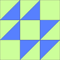
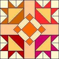
Anyway...Once you know the Brackman Number for a pattern you can look it up in my bound Encyclopedia or if it's pieced and a block in BlockBase.


The New England quilt above is number 1689a.
Pattern names include Double X, Jackson Six and Old Maid's Puzzle.

In BlockBase you can print out a pattern too.

Here's a detail of another quilt I liked from the Index.
 I looked at the full record and found the Brackman Number.
Here's the full record link:

It's #3807
Clicking on the "Search by Number" area of BlockBase I found that it has many names, among them Dutch Rose, Triple Star and Eccentric Star.

One can browse through the many thousands of quilts on the Quilt Index, check out its pattern number (the Brackman number) and find the pattern in BlockBase. If you have the number it's easy to find the pattern, which can be printed any size for template piecing, rotary cutting or paper piecing.

#3119


# 4065 and #1950

Sunday, August 22, 2010

Document and Reproduction: Cretonne

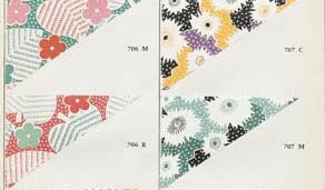
Document print for "Ohio Autumn", a cretonne from Arnold's attic

"Ohio Autumn" recolored for Arnold's Attic

Cretonne, a word once common in the American female vocabulary, is now obscure. I first heard it in the 1970s when I was teaching quilting in Chicago. I suggested the students buy some large-scale prints to contrast with their calicoes. An older woman glared at me: "I'm not putting any cretonne in my quilts."


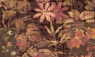
Bronze-shaded swatches on top of a cretonne quilt back.

She pronounced it CREE-tawn with the emphasis on the first syllable and explained that cretonne was a cheap print, prone to fading and too coarse a weave for patchwork. She was talking about the furnishing fabric she grew up with, inexpensive large-scale prints that were used to cover footstools, drape the kitchen sink and tie into whole-cloth coverlets.


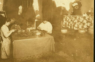
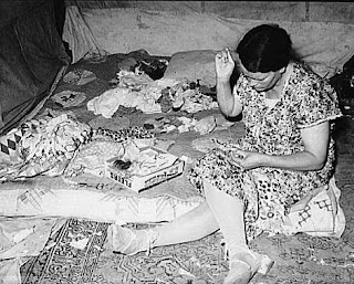
Photo by Lewis Hine, about 1910, of a family making paper flowers.
Collection of the Library of Congress.
The cretonne-draped clock shelf on the right was a common feature of interior decorating. Hines, documenting child labor, viewed these New York City apartments as dreary but the women's use of fabric for inexpensive decorating was often very up-to-date.

The name cretonne seems to have come into use in America in the 1870s, as a synonym for chintz. Large-scale prints, the European chintzes that had been so popular in quilts made before the Civil War, came to be "chintzy" in the eyes of tastemakers. Quilters focused on calicoes, the small-scale prints so popular in the log cabins, charm quilts and scrap quilts of the late 19th century.


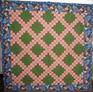
Irish Chain with a large-scale print as a border, 1870-1910?.

This quilt is a little odd in its mixed styles and hard to date from the little photo in an online auction. The ordered patchwork design pieced of bright calicoes with no neutral was popular at the end of the 19th century, particuarly in southeastern Pennsylvania. But the use of the large-scale cretonne for a border is quite old-fashioned.

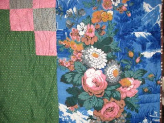
Is that blue fabric a European chintz or
a later domestic cretonne imitating an earlier color scheme?


Larger-scale fabrics remained widely available. Cretonnes were the "proper thing for draperies, hangings, furniture covering, etc." according to the Sears catalog. The name cretonne (pronounced cruh-TAWN in imitation of the French word) is derived from Creton, a French town that had specialized in manufacturing a coarse cloth made from hemp.
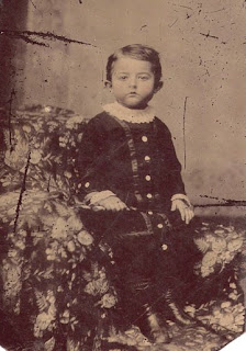
Tintype of a boy on a cretonne throw
about 1870


In 1889 Chambers Encyclopedia defined cretonne as
"originally a white cloth of French manufacture…now applied to a printed cotton fabric used for curtains or for covering furniture, which was introduced about 1860. Chintz, so much employed for the same purpose in former years, is a comparatively thin printed cloth usually highly glazed. Cretonne, on the other hand, is generally thick and strong for a cotton fabric, and with a twilled, crape, basket, wave, or other figure produced on the loom. When a pattern is printed on this uneven surface (it is sometimes plain), it has a rich, soft appearance. A cretonne is rarely calendered or glazed. The thick weft threads of inferior qualities are commonly formed of waste cotton, and the patterns upon these, though often bright and showy, are as a rule printed in more or less fugitive colours."
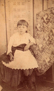
Cabinet card of a girl and a cretonne wholecloth coverlet
about 1890

In a 1918 definition, chintz was described as the English word and cretonne as the French word for drapery prints. The reality may be that cretonne as a name for inexpensive cotton furnishing prints is a Frenchification that elevated mundane goods to a more sophisticated level, much in the way that those of us who buy our wardrobes at Target or J. C. Penney pronounce the stores' names with a French accent when asked where we shop.

The arc of taste swings between clutter and simplicity. As modernism dictated austerity one magazine advised in 1919:

"Cretonne curtains are used by interior decorators in rooms where odd chairs are covered with various patterns of cretonne, but this treatment requires a most experienced eye. A motley color scheme is best avoided by the average home decorator. Even when beautifully harmonized by an expert, the use of a number of colors and patterns becomes tiresome in a short time as plain effects never do."

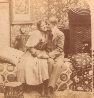
Plenty of cretonne creates a "motley color scheme" in an 1897 stereo card studio.

Cretonne was old-fashioned then, but that's why we love it today.

For more about cretonne see my book Making History: Quilts and Fabric 1890-1970.
http://www.ctpub.com/productdetails.cfm?PC=1212

Wednesday, August 18, 2010

Hooverettes


The cotton prints we see in mid-20th-century quilts were common for fashionable clothing, but later generations remember them primarily as aprons or house dresses, the everyday work clothing women wore before a pair of blue jeans became the smart choice for housecleaning.


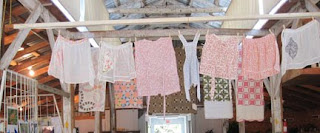
Vintage aprons on display at the Vinland Fair last week.

Check out the Vinland Fair blog by clicking here:

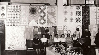
Vinland Fair about 1950

People sometimes call these pastel florals "Apron Prints" or "Housedress Prints"

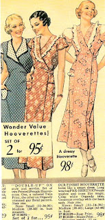
The page for "Housewear" in the 1935 Sears catalog offered several variations of inexpensive dresses that "launder easily."


Among the frocks, smocks, coverall aprons and coat dresses are three "Hooverettes", a term that seems forgotten.

 One would guess the clothing was named for Herbert Hoover who was President from 1929 to 1933. Although most of the suffering occurred after Roosevelt took over, Hoover carried the blame for the Great Depression.

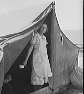
Dorothea Lange portrait of a woman in a California camp in the 1930s.
Library of Congress.
We empathize with her homelessness,
but she'd probably like to be remembered
 as neatly dressed in cotton clothes fashionable at the time.


"Hoover buggies" were old cars so broken down they were pulled by horses; "Hoovervilles" were camps for the homeless and "Hoover hog" was a main dish of rabbit or armadillo.

Hooverette as a name for a dress costing 47 cents might thus reflect depression frugality. However, the Dictionary of American Region English defines "Hoover Apron" as slang for a coverall or housedress with an overlapping reversible front, a name reflecting Hoover's earlier career as an effective administrator of post-WWI-relief in Europe. The wrap-front dress could be worn until the bodice was dirty and then the overlap reversed to reveal a clean area. The name Hooverette or Hoover Apron alludes to an efficient work dress.


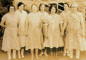
Women photographed in the 1930s. On the back of the photo is a note: "These are the girls (maids) I work with."
Two of the women (back row left and right) seem to be wearing Hooverettes, wrap garments that can be overlapped in the other direction to show a clean dress.


For more about fabrics and quilt style from the 1930s and 1940s see my book Making History: Quilts & Fabrics 1890-1970.
Click here to see several of the pages in a Google Preview:


Another woman in a migrant labor camp in the 1930s,
 Picture from the Library of Congress

Monday, August 16, 2010

Period Prints: Double Blues


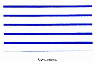
The current term for these bright blue prints is “Lancaster blue” because the quilters who lived in Lancaster County, Pennsylvania, were so fond of the shade. The dyers, printers and designers who produced the fabrics may have called the color ultramarine, the name of the dyestuff.


A double blue print---2 shades of blue on white
We see this blue with a touch of violet often in late 19th century quilts. The color is generally in figures on white grounds. Above is a double blue print; below a single blue.

A single blue print in a quilt dated 1875
Like double pinks, the double blues varied in color intensity depending on the proportion of dark and light color on the background.

A double blue print in a quilt dated 1909


The prints can be classified as shirting prints, small figures on a white ground. They were used for dresses, baby clothes and men’s and boys’ shirts. The prints are a good clue to a post-1870 date when quilters raided the scrap bag for pieces of the periwinkle blue prints to scatter through log cabins, charm quilts and other pieced designs in the 1870s and ‘80s.


The dye may be ultramarine, a pigment also useful for printing cotton. In an 1882 dye manual William Crookes was extremely enthusiastic. "The artificial production of this magnificent pigment is one of the greatest conquests of modern chemistry."


Above a swatch of blue striped cotton from Crookes's dye manual


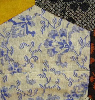
A hexagon in a charm quilt, pieced together from two tiny scraps

My guess is that about 1870 the American textile industry developed inexpensive methods to print calico with ultramarine creating a fashion for a novel color that lasted until about 1900 or 1910.


The exception to the dating rule (1870-1910) is the women of southeastern Pennsylvania (Berks, Lancaster and Montgomery counties) who maintained a regional fashion for the blue prints. They loved to set the bright blue right next to other primaries in their distinctive palette rarely seen outside the area.


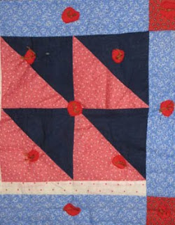
Another notable Pennsylvania style is the use of a double-blue print or a blue-violet solid as background for traditional appliqué of red, green, pink and yellow. A blue-violet background or double blue used as “the
main color field,” as quilt historian Nancy Roan described it, offers a good clue to a southeastern Pennsylvania quilt and to a date of about 1880-1930.

See a gallery of Pennsylvania quilts at RickRack.com, Sharon's Antique Quilts:
http://www.rickrack.com/gall.html

And see her blog post about a Berks County applique pattern, sometimes done on blue, by clicking here:
http://www.rickrack.com/rickrackrag/?p=31