Friday, December 30, 2011

Complex fabric --Simple patchwork

Birds in a Cherry Tree by Bobbi Finley,
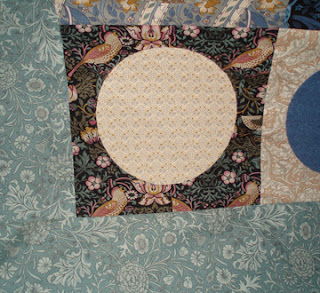
A tile quilt appliqued from some complex Morris reproductions


Quilters have to think about
Pattern in the Fabric versus Pattern in the Patchwork
We have at least four options.

1) Complex fabric---complex patchwork, as in Bobbi's block above
Mid 20th-century bowtie top
2) Simple fabric---simple patchwork. A very modern look.

Nineteenth-century pieced star
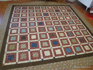
3) Simple fabric-- Complex patchwork. One reason 19th century quilters loved those little calico prints

Octagons from Ann Marie at AMSewing
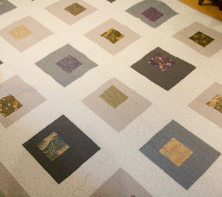
4) Complex fabric --simple patchwork
The William Morris reproductions are complex prints. Here are some simple designs that balance that complexity.
And how she pieced it:

From Jane Monk's Purrfectly Quilted blog, using the last collection The Morris Workshop
http://purrfectlyquilted.blogspot.com/2011/02/sneak-peek.html


Here's a square in a square made with the same collection by Jen from Sweden. I found it at the Cutting Table Blog
http://blog.missouriquiltco.com/special-order-from-sweden/

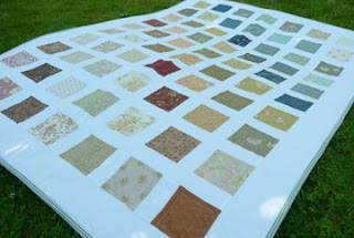
From another Jen - 2 charm packs from Moda
http://jenacknitwear.typepad.com/blog/2011/07/fo-quilt-for-the-newly-weds.html

This one using a Charm Pack from my last Morris collection The Morris Workshop is from the Pieced Goods blog.
In the last two examples I guess we have to say they combined complex and simple fabric with simple patchwork--option number 5, I guess.

Successful quilt designs strike a good balance between complexity in the fabric and complexity of the patchwork. Beyond that it's a matter of taste. Is it simple or stark? Complex or too busy?


Tuesday, December 27, 2011

Does Anyone Look Good From This Angle?

Poor Overall Guy: It's just not a good angle.

Maybe he shouldn't tuck his shirt in.


And not put so much stuff in his pockets.

But then again we don't want to see him from the front....

Saturday, December 24, 2011

Pink & Rose for Morris & Company


Pink and Rose was an 1891 wallpaper pattern designed by William Morris himself in his later years.

For the print in Morris & Company we did it as a monochrome print, a good foil for the multicolored, more dramatic prints like Wandle or Anemone. (But none of it is pink or rose-colored.)

Anemone..........Honeysuckle........Pink & Rose...Anemone

The pink---a carnation

Pink is an old-fashioned name for carnation (Dianthus),  a flower with pinked edges. Over the generations the word came to mean the pale red color of a popular carnation, so now we have pink pinks.
Pink carnation with pinked petals

Pinking shears
  
The rose in the print---a wild rose

See a piece of the original Pink & Rose wallpaper in the collection of the Metropolitan Museum of Art by clicking here:
http://www.metmuseum.org/toah/works-of-art/23.163.4a  

The print would make a good background for applique in the Morris style, adding another layer of pattern,as in this mockup I made of the intricate center block Michele Hill designed for her Friends quilt.

Or this motif from the My Renaissance sampler. Her two books William Morris in Applique and More William Morris in Applique offer much inspration.


See more about Michele's designs at an earlier post.
http://barbarabrackman.blogspot.com/2011/01/michele-hills-more-william-morris.html 

Wednesday, December 21, 2011

Festival of Trees

Every year my friend Georgann and I decorate a tree for a charity tree auction. Our theme this year was Chinese. We bought lots of red and gold items in Chinatown all year.

There were pink and red paper parasols and Georgann strung old mah-jongg tiles on red ribbons.

We always like to see what other volunteers have done (collecting ideas for our sketchbook, so to speak.) We saw a lot of feathers in trees this year. This red feather boa diffuses the light in strange ways.

We liked this idea of ribbons threaded with beads---anything to do with fabric.


I also go look at the big time---San Francisco in December.

Macy's on Union Square has some wonderful trees.
Upside down.

A snowy tree covered with creatures that live in cold climates


The store windows are always festive.

Sephora did a lot of curled paper


A star of blue jeans from The Gap

And metallic ribbon threaded through string at Anthropologie.


Sunday, December 18, 2011

Charm Pack Tree


I had a Charm pack of Morris & Company squares and a styrofoam cone so I decided to add a little William Morris to the otherwise tacky decoration scheme I am so fond of. I don't think Morris & Company decorated with polka-dot brandy snifters full of mini-disco balls, but the combination is pretty good.


The Charm Pack has 42 squares cut to 5". I sorted them into lightish and darkish (the pack actually comes pre-sorted in a way.) I folded each into a triangle and then again into a triangle so there is one raw edge. I pinned each to the cone with two pins. I started at the bottom and let them overlap the bottom of the cone so it wouldn't show.

I alternated rows of lights and darks and didn't do much in the way of math. Just layered. I wish now I'd had a cone with a pointy top.


Dot did not think much of the whole idea. She might be channeling for William Morris. I think that's exactly how he'd look at it.


When I got to the top I folded one square into a strip and pinned it around the top. I had a glittery pick (left over from a bouquet of pure tackiness) so I cut some wires there and stuck them in the top in frivolous fashion. I propped it up on a small antique saucer turned over and secured it with a little tacky stuff (the other kind of tacky.) But you could also burrow out a little hole in the base of the cone and stick a spool in there as a base too.

It's a gift idea for a quilter as she can unpin the pins and use the Charm squares and the pins.


You need
A Charm pack (42 squares 5" x 5") I had a few left over.
84 pins (2 for each square)
1 styrofoam cone about 13" tall
Some glitter for the top and a wire cutter
A base of a spool of thread (could be part of the gift) and some kind of removeable adhesive

GIVEAWAY
I have an extra charm pack and I will send it to someone who comments in the next 24 hours.
THE GIVEAWAY IS OVER.
TERR WON.
I DECIDED I WOULD USE A NUMBER FROM THE NEWSPAPER FOR MY RANDOM NUMBER---(I KNOW IT'S NOT REALLY RANDOM)
On the sports page the combined score in the Kansas City Chiefs upset of the Green Bay Packers yesterday was 33.
Congratulations to her and thanks for the comments. Dot loves to be called cute.

More Out-of-Control Quilts

I went through my collection of photos from online quilt auctions and found some sad situations.

Mostly planning problems

Although some quilt wrecks look like things were better a few decades ago before the fabric faded.

Here we have a planning problem. It's probably better to chop those hexagons into a rectangle rather than to try to follow them out to the edge.


To be fair here: I think some of the design problem is a blue fading completely to white.


And this old quilt was never meant to be shown on a line. It probably looked fine on a bed, when there weren't a lot of ducks in a row to contrast it to.

Sometimes you don't see the problem till you step back.


And in other situations it's hard to analyze just where things started to go wrong.